
I received a request today for help creating CSS styling for placeholders. Styling placeholders falls outside the scope of standard WEBDEV style settings, meaning pure CSS is the only option. This involves challenging, vendor-specific CSS. However, Tailwind CSS comes to our rescue!
What is a placeholder?
First, let’s define what a placeholder is. We’ll start with a definition from a reliable HTML/CSS source, W3 Schools.
The placeholder attribute specifies a short hint that describes the expected value of an input field or a textarea. The short hint is displayed in the field before the user enters a value.
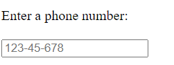
Maybe a visual aid would help? The text 123-45-678 is a placeholder. As soon as the field has a value, it will replace the placeholder. I’m not sure which country uses this phone number format! 🙂
Placeholders in WEBDEV
There are “two” methods to set a placeholder in WEBDEV. However, the “air quotes” hint at an issue, as there is effectively only one method we can use in this example.
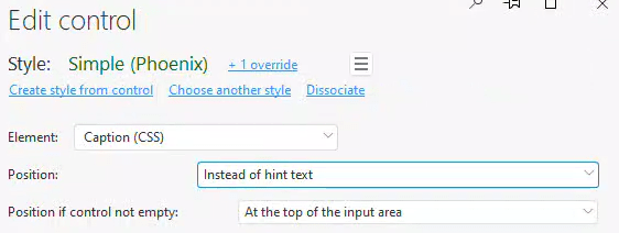
The Caption as Placeholder
This is my usual method as it creates an appealing interface and is convenient. We begin with a standard edit control. For the caption style, we set the Position to “Instead of hint text” and the Position if control not empty to “at the top of the input area”.
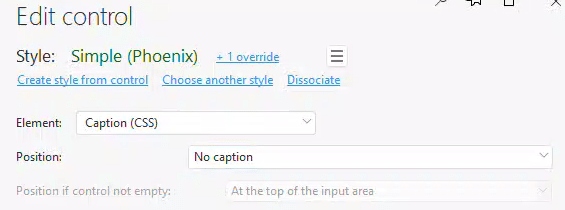
Hint text as Placeholder
For this method, choose any option from the “Position” selection that isn’t “Instead of hint text”. Then, enter the placeholder text in the “Help→Hint Text” field. In this example, I’ve chosen “No caption”.

What’s the difference?
We can immediately see a difference between these two options, both in the IDE and when rendering the web page. The Caption version appears in the standard font and is slightly darker, while the Hint Text version is italicized and lighter.

If we examine the HTML, we can see why. The caption version isn’t really a placeholder, they are using some fancy jQuery and CSS to get the caption to display in the input box and then shrink up to the top when the control gains focus. There is no placeholder property set on the input element.
Upon examining the HTML, we can see why, the caption version is not a “real” placeholder. The effect is achieved using jQuery and CSS, which makes the caption display in the input box and then shrink to the top when the control gains focus. There is no placeholder property set on the input element.

The Hint Text version utilizes the standard placeholder property.

This means you shouldn’t waste your time trying to style the caption version using placeholder CSS, as it won’t apply. This is also why the hint text version looks different—it receives some default placeholder styling.
Styling the placeholder with CSS
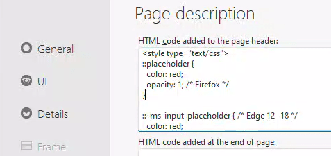
As previously stated, WEBDEV doesn’t have settings for styling placeholders, requiring the use of pure CSS instead. For instance, if we want to change the placeholders to red, we can add a bit of CSS as follows:
::placeholder {
  color: red;
  opacity: 1; /* Firefox */
}

::-ms-input-placeholder { /* Edge 12 -18 */
  color: red;
}
First, take note of the comments about Firefox and Edge. Depending on the browsers and versions you choose to support, this can quickly become challenging. For example, supporting a few older browsers as well would look like this:
::-webkit-input-placeholder { /* Chrome/Opera/Safari */
  color: red;
}
::-moz-placeholder { /* Firefox 19+ */
  color: red;
}
:-ms-input-placeholder { /* IE 10+ */
  color: red;
}
:-moz-placeholder { /* Firefox 18- */
  color: red;
}
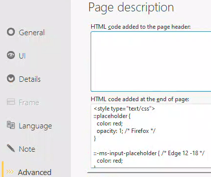
You get the idea 🙂 Whoever said the browser wars were over was mistaken! But let’s get back to WEBDEV. To implement this in WEBDEV, we need to get the CSS code on the page. The simplest way to achieve this is by placing a <style> tag in the Page description→HTML code added to the page header area, as shown below.
Spoiler Alert: this approach doesn’t work. Upon investigation, you’ll find that the reason is WEBDEV’s existing CSS code, which styles the placeholder in the static.css file. This file loads later in the source, thus winning the “cascading” battle.

To ensure the code loads after static.css, we should place it in the “HTML code added at the end of the Page” section. Alternatively, we could create a separate CSS file and add it as an external resource, which would also load after static.css.
In either case, we win the cascade war, and our placeholder text turns red. However, this only works for the “real” placeholder. Our caption version remains unaffected.

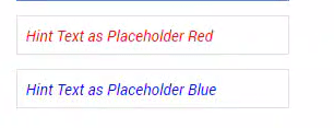
Okay, you might think it’s not too bad, even with the vendor-specific settings. But what if we want to control the placeholder color on individual controls? For instance, we want it to be red on one and blue on another. Why? The use case that led to this example involved edit controls with different background colors, hence the need for different placeholder colors.
Since ::placeholder is a pseudo-selector, it can’t be used with inline CSS. This means we can’t add it to the style of a single control. In order to target specific fields, we need to write CSS class code. As with any WEBDEV task involving CSS, JavaScript, or jQuery, the first step is to turn off the ALIAS compression in the generation options of the page or the project.

Next, we’ll adjust the CSS to include a selector that only affects one element. We can achieve this by targeting only input elements with a specific ID. When we disable ALIAS compression, the ID of our element matches the control name, but in all capitals. As a result, our CSS looks like this. You probably are beginning to understand why it might be preferable to use an external CSS file instead of incorporating it directly into the page HTML:
<style type="text/css">
input[id^="EDTEDIT2"]::placeholder {
  color: red;
  opacity: 1; /* Firefox */
}

input[id^="EDTEDIT2"]::-ms-input-placeholder { /* Edge 12 -18 */
  color: red;
}
input[id^="EDTEDIT3"]::placeholder {
  color: blue;
  opacity: 1; /* Firefox */
}

input[id^="EDTEDIT3"]::-ms-input-placeholder { /* Edge 12 -18 */
  color: blue;
}
</style>
You’ll observe that I’ve added a second edit control, and they each use a different color for the placeholder.
Styling the placeholder with Tailwind CSS
Before continuing, please make sure to read my other post on Tailwind CSS!
Tailwind CSS generates the CSS classes on the fly as we style the controls. This not only targets a specific control, but also handles all the vendor-specific elements for us. There are additional styling concerns for edit controls when using Tailwind CSS. However, for now, we’ll focus solely on achieving our placeholder styling.
Our Caption and Hint Text settings and requirements remain the same. The only change needed is to add a Tailwind style to the input area: either “placeholder-red-400” or “placeholder-blue-400”. We’ll cover border styles and other related topics in the future.

I now have a Red placeholder on one edit control and a Blue placeholder on the other. There’s no need to worry about vendor-specific CSS or really any CSS for that matter. Decide for yourself which solution is easier!

We are beginning to observe the functionality and productivity that Tailwind CSS introduces to WEBDEV, and why I am so enthusiastic about the potential it offers.
 wxBlog - All things wx – Covering pcSoft products (WINDEV, WEBDEV, WINDEV Mobile)
2 thoughts on “Evidence that Tailwind CSS could be the droids we are looking for!”