
I’ve never hidden my thoughts about Responsive Design. While it’s great for content sites, it may not be suitable for web applications, which most of us create. It seems unrealistic to expect Responsive Design to produce a web application that looks and functions well on every device, from an iPhone SE to a 50-inch 4K monitor.
Putting aside the challenges of navigation and display for all these devices, it’s misguided to assume that a user will interact with the application in the same way across different devices. The necessary functionality varies depending on the device, so why should we strive to offer identical screens and features on all platforms?
Why should the developer or the user have to accept compromise when there’s no need to do so? In most of my projects, the user experience is tailored to the device and that device’s specific use case.
I’m not claiming this is true for every web application and use case. But perhaps it’s time to put down the responsive design hammer and occasionally pick up a screwdriver. After all, not all web applications are nails!
If you’re still here after my rant, I assure you there’s a purpose. The aim of my new series, Modern Web Design with WEBDEV, is to explore all the options we have today. We’ll examine how to best combine them for various use cases and scenarios. This includes Layout, CSS Grid, Flexbox, and Tailwind CSS. Although I’m unlikely to explore framework options like Bootstrap or Angular, I feel if I were to use those, I might as well transition to these frameworks and access my business logic and data through a RESTful API written in WINDEV. I invite any WEBDEV developers who has successfully used any of these technologies to contribute to this series.
Hopefully, as we progress, we can explore other use cases, potentially even the elusive 100% responsive web application! Today, though, we’ll focus on my typical use case and my current perspective on it.
Be aware, this is experimental work at this stage and may change as it’s applied to production. One of the goals of this series is to stimulate honest conversation and collaboration, combining different techniques and viewpoints into the ultimate WEBDEV guide. It’s certainly an ambitious goal!
Tablet First – Mobile Later Development
If you are unfamiliar with that term, it is because Uncle Pete just coined it 🙂 It’s been my fundamental design philosophy since I started developing web applications, but I only recently put a named to it. When you delve into responsive design, you’ll often encounter terms like Mobile First and Desktop First. As their names suggest, Mobile First means designing your website with mobile devices in mind, then using responsive design to scale it up. On the other hand, Desktop First involves starting with the “big display” and then figuring out how to scale it down to mobile. If your end goal is a truly responsive application that fits all devices, the Mobile First approach is likely the better one.
However, for most of my projects, neither approach seems sensible. Instead, I start in the middle, knowing that I will likely end up with at least two vastly different interfaces when the project is completed. One is a mobile web application, tailored for that use case, and the other is my primary application for “everything else”.
My first step is to determine the smallest target device for the “everything else” application. If you’re creating an application for a mobile workforce equipped with 15-inch laptops, there’s no need to compromise the design to support a smaller resolution that doesn’t match your use case. If I don’t have that luxury, I consider tablets as my smallest target, hence the term Tablet First!
Finally, some actual technical information!
First, understand that this process is as much an art as it is a science. This is how I arrived at my current goals. I am open to other thoughts or suggestions on the subject.
In this specific use case, our main focus is on laptops and larger devices. However, we also need to ensure compatibility with tablets. The following information is based on my research, much of which was derived from https://prototypr.io/post/ultimate-guide-to-artboard-size-for-web-apps.
- In order to cater to tablets, we should target a screen resolution of 1024×768.
- Support for laptops will begin at 1280.
- We need to allocate 12-20 pixels for the vertical scrollbar.
- Vertical scrolling is usually not a significant issue, but if you are aiming for a no-scroll experience, then you should consider the aspect ratio. Most Windows hardware operates on a 16:9 ratio, while Apple devices use a 16:10 ratio.
- While I don’t concern myself with vertical scrolling, I initially size my page template to avoid scrolling. This ensures I know what content will fit without having to scroll. Therefore, you should subtract 72 or 104 pixels to accommodate the browser’s address bars and tabs.
In this layout, I’ll include a Header, Footer, Main section, and a full-height left-hand menu. This design supports a tablet-first approach without compromising the laptop experience. The left-hand menu will display icons for tablets and icons with text for larger devices. I’ll allot 32 pixels for the icon-only version and 144 pixels for the larger menu version.
The choice of 144 over 150 is due to Tailwind and CSS considerations. When crafting designs that look good on multiple devices, particularly concerning font sizes, units like em or rem are used. While I won’t delve into all the technical details, keeping measurements divisible by 4 helps. Tailwind’s built-in height and width settings are based on rem. As these values increase, they start to skip sizes, leaving us with options like 36 (144) or 40 (160). We could choose 37 (148), but that would require using arbitrary values. Unfortunately, there’s a WEBDEV issue that makes using arbitrary values difficult. So, we’re sticking with 144.
Now, we just need to calculate the numbers for our targets.
The tablet width is 1024. If we subtract 20 for the scrollbar, we get 1004. By subtracting an additional 32 for the left-hand icon menu, the main content area size becomes 972.
Although we will make adjustments later, we don’t want to change the content size for the larger target yet. To determine our initial targets, we start with 972 and add 144, resulting in 1116. This number is our target for laptops and larger devices.
We will create our template to fit without vertical scrolling. So, subtract 104 from 768, which gives us 664. We’ll allocate a total of 96 vertical pixels for the header and footer notice this is once again divisible by 4. We’ll assign 24 pixels to the footer and 72 to the header. However, you’re welcome to choose a different allocation that suits your needs.
Finally, this results in the content area of the template being 568 pixels tall.
💡 You might question some of the numbers above, after all your Pixel 8 Pro has a screen resolution of 1344 x 2992, which surpasses the minimum resolution for laptops. In web design, we refer to "magic pixels" determined by your Device Pixel Ratio (DPR) and Pixels Per Inch (PPI) Density. Simply put, this measures how many screen pixels are required before it is visible to the naked eye. In the case of my Pixel 8 Pro, checking its resolution on https://www.whatismyscreenresolution.org/ reveals that the web considers its resolution to be 396 x 880.
Would you like those numbers in a more accessible format?

The end results will appear as follows when viewed on any device larger than a tablet.

But this when displayed on a tablet

Equally important to me, it appears as it should in the IDE, so I don’t need to guess or use any hacks when positioning things while developing.

Creating the layout in WEBDEV
We are not going to use CSS Grid or Flexbox for this layout. We might use them later within some of these sections, but they are not necessary at this point. I experimented with creating this layout using both in WEBDEV, but it seemed to complicate things, particularly in maintaining WYSIWYG in the IDE.
This layout requires a total of 4 cells and some settings on the page itself. Let’s start with the basic setup, then we’ll add the resizing feature for the left-hand menu. We’ll define everything in the IDE, with the left-hand menu width at 144 pixels.

💡 When I first began this exercise, I followed the traditional WEBDEV approach of always using container cells, as we initially did with zones. I had a cellPage containing cellLeftMenu and cellRight, and within cellRight, there were cellHeader, cellHero, and cellLeftMenu. However, this approach had issues. Along with these cells, WEBDEV generated additional positioning tables that wrapped some of my cells. Specifically, there was a positioning table around cellLeftMenu, and the required Tailwind CSS needed to be applied to that instead of just the cellLeftMenu. This required some jQuery.

Once I eliminated the surplus container cells, I no longer needed any jQuery code Not only is the designer cleaner in the IDE, but the resulting HTML is also much cleaner as well! The takeaway: avoid using excessive container cells unless absolutely necessary.
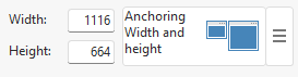
Page Settings
The page dimensions are set to 1116 x 664 with anchoring for both width and height. We don’t require any page or browser color or border settings, so they are all set to <undefined>.


cellLeftMenu
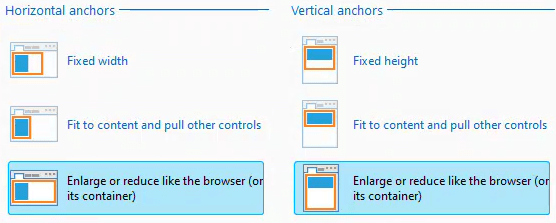
It is positioned at 0 x 0 and measures 144 x 664, with anchoring set for both width and height. The only difference is the Horizontal anchor, which is set to “Fit to content and pull other controls” instead of “Enlarge or reduce like the browser (or its container).”


During initial design and testing, I find it beneficial to assign a distinct background to each section. I achieved this using Tailwind by adding the “bg-green-200” CSS style. While you can also adjust the background using the WEBDEV style settings, I prefer to use Tailwind for as much as possible in order to maintain consistency. Although WEBDEV styles will still play an important role in the future, for now, we will primarily use individual Tailwind styles.

We will revisit the resizing later. For now, just ensure that there are no other WEBDEV style settings on the cell.
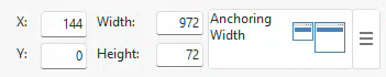
cellHeader
It is positioned at 144 x 0 and has dimensions of 972 x 72. The anchoring is set for width only. The test coloring used is “bg-blue-200”.

cellHero
I previously referred to this as ‘cellContent’, but the current trendy term is ‘Hero section’ and I am nothing if not trendy 🙂 It’s positioned at 144 x 72 and measures 972 x 568, with anchoring set for both width and height. As this section is designed to consume any unused space, both dimensions are set to “Enlarge or reduce like the browser”. No background is set for this section, resulting in a white display.

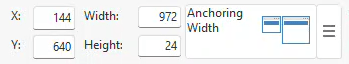
cellFooter
It is in position 144 x 640, with dimensions of 972 x 24, and is anchored for width only, just like the header. The test coloring used for it is “bg-red-200”.

Some Tailwind background and prep work
Before proceeding, you might want to check out my other Tailwind posts. They provide foundational information not covered in this post.
The reason I believe Tailwind holds great potential for WEBDEV developers is the ability to extend and customize it, as we are about to demonstrate. Tailwind is designed with Responsiveness in mind. It has predefined breakpoints, which can be utilized as prefixes for all other utility classes, making them conditional. These breakpoints are equivalent to media queries in CSS. This feature is highly powerful, allowing changes at any given breakpoint.
Like most features of Tailwind, you can customize and extend breakpoints through the Tailwind config file. Tailwind was designed with a mobile-first approach. The breakpoints are defined as min-width breakpoints. Therefore, any utility class without a prefix applies to all screen sizes, while prefixed classes apply from that size upwards. While it’s possible to redefine the breakpoint prefixes for a desktop-first style, I feel it’s best to avoid making such significant changes during early stages of exploration with Tailwind.
I also encountered a few challenges from WEBDEV that influenced the solution I developed. For instance, if we wanted a element to remain hidden on small screens and only appear on screens larger than a table, we should be able to accomplish this by adding two utility classes: “hidden” and “xl:block”. These classes apply the CSS property “display:none” by default and change it to “display:block” once the screen width exceeds 1280. This works as expected in a pure HTML/CSS setup. However, when attempted in WEBDEV, the element remains hidden regardless of the browser size.
Why is this happening? Once again, the extra CSS WEBDEV generates is causing an issue. This time, it’s coming from the static.css file. Using the developer tools, we can see our Tailwind CSS class .hidden, but it’s crossed out, indicating it’s not being applied. Conversely, the .hidden class from the static.css file is being applied.
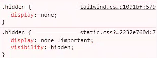
In my post, Dipping our WEBDEV toe into the Tailwind CSS pool, I mentioned the advantage of using Tailwind is that the tailwind.css file is applied after the standard.css and static.css files, allowing it to win the Cascade wars. However, I omitted a crucial detail, the use of !important in the static.css version, is a cheat that allows it to win the war. This is a method sometimes used in complex CSS files to enforce a specific setting, regardless of the order of the CSS. Many web designers consider it a crutch and somewhat of a bad practice, likening it to the “GOTO” statement in programming. Would you believe that WEBDEV uses !important 125 times in the static.css file alone? It’s like maintaining a program with 125 nested GOTO statements!
The !important property significantly limits the solutions available to me, all of which are unsatisfactory. I could expand the Tailwind utility class to also include the !important property, which would win the Cascade battle, but adding another GOTO isn’t usually the best solution.
There’s also the issue with “visibility:hidden” in the static.css version. I would need to change that to “visibility:visible” whenever I want the control to be visible. Unlike the standard.css file, which is continuously regenerated, the static.css file isn’t. In theory, I could entirely remove the .hidden class from it, but that seems like a poor solution. It would require me to maintain it with each update of WEBDEV and still leave me with 124 GOTOs!
Unfortunately, I think the “right” solution should come from PCSOFT. They need to avoid using class names that conflict with Tailwind. Even better, if they could use Tailwind CSS themselves, it would make the transition seamless for us. If nothing else, they should at least reduce the use of !important in their CSS files.
After experimenting with various solutions, I settled on one that not only resolves the issue but also facilitates ‘Tablet First’ design without excessive customization of Tailwind. I will extend the Tailwind breakpoints by creating an additional breakpoint that starts at 1px. The usefulness of this will become apparent shortly. It’s worth noting that this approach might not be recommended by all Web/Tailwind developers, but it’s the simplest solution I’ve found as a WEBDEV/Tailwind developer.
Media breakpoints have to be in the correct order, as the function similar to a rock sorter. Which means my new break point needs to be the first one. Tailwind gives us the ability to do this without rewriting all the break points with the use of the “…defaultTheme.screens” function. I won’t bore you with how the sausage was made, but here is my current tailwind.confg.js file for this project. the “screens: section is the only portion that applies to today’s exercise.
Media breakpoints need to be in the correct order, functioning similar to a rock sorter. This means our new breakpoint should be the first one. Tailwind facilitates this without requiring us to rewrite all the breakpoints, by using the “…defaultTheme.screens” function. Without going any deeper into how the sausage was made, here’s my current tailwind.config.js. The “screens” section is the only part relevant to today’s exercise.
/** @type {import('tailwindcss').Config} */
const defaultTheme = require('tailwindcss/defaultTheme')
module.exports = {
	content: ["./**/*.html","./**/*.htm", "./**/*.php"],
	theme: {
		fontFamily: { // <https://github.com/system-fonts/modern-font-stacks>
			systemui:     ['system-ui', 'sans-serif'],
			transitional: ['Charter', 'Bitstream Charter', 'Sitka Text', 'Cambria', 'serif'],
			oldstyle:     ['Iowan Old Style', 'Palatino Linotype', 'URW Palladio L', 'P052', 'serif'],
			humanist:     ['Seravek', 'Gill Sans Nova', 'Ubuntu', 'Calibri', 'DejaVu Sans', 'source-sans-pro', 'sans-serif'],
			geohumanist:  ['Avenir', 'Montserrat', 'Corbel', 'URW Gothic', 'source-sans-pro', 'sans-serif'],
			classhuman:   ['Optima', 'Candara', 'Noto Sans', 'source-sans-pro', 'sans-serif'],
			neogrote:     ['Inter', 'Roboto', 'Helvetica Neue', 'Arial Nova', 'Nimbus Sans', 'Arial', 'sans-serif'],
			monoslab:     ['Nimbus Mono PS', 'Courier New', 'monospace'],
			monocode:     ['ui-monospace', 'Cascadia Code', 'Source Code Pro', 'Menlo', 'Consolas', 'DejaVu Sans Mono', 'monospace'],
			industrial:   ['Bahnschrift', 'DIN Alternate', 'Franklin Gothic Medium', 'Nimbus Sans Narrow', 'sans-serif-condensed', 'sans-serif'],
			roundsans:    ['ui-rounded', 'Hiragino Maru Gothic ProN', 'Quicksand', 'Comfortaa', 'Manjari', 'Arial Rounded MT', 'Arial Rounded MT Bold', 'Calibri', 'source-sans-pro', 'sans-serif'],
			slabserif:    ['Rockwell', 'Rockwell Nova', 'Roboto Slab', 'DejaVu Serif', 'Sitka Small', 'serif'],
			antique:      ['Superclarendon', 'Bookman Old Style', 'URW Bookman', 'URW Bookman L', 'Georgia Pro', 'Georgia', 'serif'],
			didone:       ['Didot', 'Bodoni MT', 'Noto Serif Display', 'URW Palladio L', 'P052', 'Sylfaen', 'serif'],
			handwritten:  ['Segoe Print', 'Bradley Hand', 'Chilanka', 'TSCu_Comic', 'casual', 'cursive'],
			fa:           ['fontawesome-webfont'],
			ion:          ['Ionicons'],
			material:     ['Material Design Icons'],
			sans:         ['Seravek', 'Gill Sans Nova', 'Ubuntu', 'Calibri', 'DejaVu Sans', 'source-sans-pro', 'sans-serif'],
		},
		screens: {
			'xs': '1px',
			...defaultTheme.screens,
		},
		extend: {
			fontSize: {
				'16px':	['16px','16px'],  //For Icons
				'28px':	['28px','28px'], //For Icons
			},
			padding: {
				'2px': '2px',  //work around WEBDEV 0.5 issue
			},
		},
	},
	plugins: [
		require('@tailwindcss/typography'),
		require('@tailwindcss/forms')({
			strategy: 'class', // only generate classes
		}),
		require('@tailwindcss/aspect-ratio'),
	],
}
I have a breakpoint prefix named “xs” in Tailwind. Tailwind allows me to target a range of breakpoints, which solves the next piece of the puzzle. In our hidden example, instead of adding “xs:hidden” “sm:hidden” “md:hidden” “lg:hidden”, I can write it as a range “xs:max-lg:hidden”. Since the control is visible by default, we don’t need to add the “xl:block” class. By adding just the “xs:max-lg:hidden” class to our control, it won’t be visible until the browser width reaches 1280. This is a significant improvement and gives us the functionality we need to continue!
Using our new Tailwind Magic on cellLeftMenu
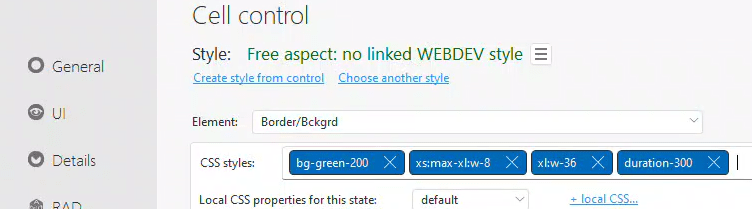
Now that we have extended Tailwind and resolved our issues with WEBDEV’s CSS, we can apply some Tailwind magic to our cellLeftMenu. In this case, we don’t want to hide it, we want to change its size. To do this, we need to add two classes to the CSS styles.
- “xs:max-xl:w-8”
- From our xs screen (1px) up to the xl screen (1280px), set the width to 8 (equivalent to 2rem or 32px).
- “xl:w-36”
- Beginning at the xl screen (1280px) set the width 36 (equivalent to 9rem or 144px)
Now, you can see the benefit of the divisible by four rule we used when setting our initial targets.
While not required, we can enhance this by adding an optional utility class, “duration-300”. Now, instead of instantly changing size, it will transition smoothly over 300 milliseconds.
The final style of our cellLeftMenu now looks like this:
And at this point, if you have made the changes to your tailwind.config.js file, and followed my notes about running our own Tailwind CLI from the Dipping our WEBDEV toe into the Tailwind CSS pool post, you should have a left hand menu that shrinks to 32px if the browser is below 1280px, and be 144px when above 1280px.
At this stage, if you’ve made the necessary changes to your tailwind.config.js file, and setup your own Tailwind CLI, as per the instructions provided in my Dipping our WEBDEV toe into the Tailwind CSS pool post, your left-hand menu should shrink to 32px when the browser is below 1280px and expand to 144px when it’s above 1280px.
Bonus Material and a Preview of What’s to Come
Although I’m not yet ready to fully delve into icon fonts, buttons, and colors with Tailwind, this post wouldn’t be complete without demonstrating how I achieve the effect of a standalone icon at smaller sizes and an icon with text at larger sizes in the left-hand menu.
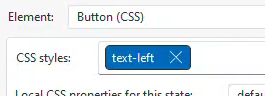
There is only one class applied directly to our button, “text-left”.
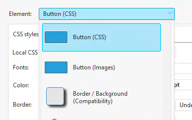
Also, ensure there are no settings under the “Border / Background (Compatibility)” element. If there are, change them to <Undefined> or <None>.

I’ve been expressing my criticism for these borders for years, and as you can see from the note on the screen, PCSOFT agrees that they aren’t ideal. I suspect the only reason they persist is PCSOFT’s dedication to backward compatibility, a commitment most IDE vendors do not uphold.
Further evidence that even PCSOFT discourages their usage comes when you remove all the settings. The option then disappears from the dropdown and there’s no way to restore those settings. This is a relatively new approach I haven’t observed before, and I appreciate it. Compatibility features remain available if I’m using them, but if not, they no longer clutter the options.

Next, we need to modify the HTML code for the button caption.

I have the following code:
<div class="text-blue-900 hover:text-red-900">
<span class="font-fa icon-28 p-2px align-middle">
</span>
<span class="xs:max-xl:hidden">
Menu 1
</span>
</div>
As mentioned, I’m not fully prepared to go cover everything in this code, particularly the part about icon fonts. I anticipate that most of this will likely undergo some modifications as I progress. The only part directly relevant to today’s exercise is the addition of the “xs:max-xl:hidden” class to the <span> that encapsulates our text. This makes the text invisible and frees up space in the DOM, allowing our menu to shrink as needed, we the browser size falls below 1280.
This basic layout example is currently live at https://wxskin.wxperts.com/
 wxBlog - All things wx – Covering pcSoft products (WINDEV, WEBDEV, WINDEV Mobile)
2 thoughts on “Tablet First Layout with WEBDEV and Tailwind CSS. No CSS Grid. No Flexbox. No JavaScript.”