
Today, we’re going to explore another “Uncle Pete” responsive design layout – the Laptop First Stacked Layout. This layout includes a top header bar, a menu bar, and a hero section. It’s designed to fit a low-end 15-inch laptop and still look good on any larger device.
“Uncle Pete” responsive does not support smaller devices. This concept is tailored for business web applications where the primary users often use laptops or larger devices. If mobile support is required, it usually involves a subset of functions and should have its own layout and interface.
The goal is to design a site that caters to the smallest device we need to support while still appearing attractive on larger devices. I previously achieved this through an “optical illusion” with full-width headers and footers, a centered hero section with no border and a background that matched the page background. However, the advancements in WEBDEV’s responsive design support now allow for a more refined approach.
For a comprehensive discussion of my thoughts on responsiveness, please refer to the post.
The Specifications
As previously stated, we have determined that the lowest supported target for this site will be a low-end 15” laptop with a viewport of 1366 x 768px. Since our design will not include a vertical scroll bar, there’s no need to allocate space for it. However, we do need to account for address bars, tabs, and any browser side gutters. The question is, what are those sizes?
After extensive Googling and encountering numerous conflicting answers, I decided to conduct my own experiments to determine my final layout size. I made a few assumptions; if you’re using a lower-end 15-inch laptop for work, you’ll likely:
- Set the Windows taskbar to auto-hide.
- Turn off any extra sidebar or ribbon bars in the browser, leaving you with the bare minimum browser interface. This includes turning off Edge’s toolbar and Chrome’s bookmark bar.
Therefore, I won’t be allocating for that space. To test, I maximized each browser on a monitor setup with 1366 x 758px, I used a handy site https://whatismyviewport.com/ and obtained the following numbers:
- Edge = 1358 x 692
- Chrome = 1366 x 679
- Firefox = 1366 x 681
- Opera = 1364 x 680
- Arc = 1350 x 727
The lowest common denominator is 1350 x 679, so we’ll start there. We’ll subtract 4 pixels in both directions to account for some border issues, which will be discussed later. Therefore, the final size of our page layout will be:
1346 x 675 pixels
We are implementing a stacked design, eliminating the need for sidebar elements. Our primary layout will comprise three elements:
- Header Bar
- The site logo, title, and quick access functions such as ‘My Profile’ and ‘Sign Off’ are included in this section
- I am reserving 72 pixels for these elements. The site will eventually incorporate a co-branding component, so I need to allocate more space for the header. Not all logos can fit into a small header. We will delve into this topic further shortly.
- Menu Bar
- This is the primary menu of the site. Unlike a multi-level popup/drilldown menu, this one directs users to different functional areas of the site. A secondary “workflow” style menu will be incorporated into those areas as needed. As discussed throughout this series, the design should cater to your use case, and this design fits ours perfectly.
- I am using 36 pixels for this section
- Hero Section
- This section is where the site content will reside. We’ll discuss different layouts for the hero section in upcoming articles. For the site’s master template, this section will remain empty. While I’ve previously included the basic inner layout of this section in my template, I’ve found the inconvenience of having to override those elements on every page outweighs the benefits. We’ll explore this more when we create these inner layouts in future articles.
- This section utilizes all the remaining space, measuring 1346 x 565.
General Project Setup
Before we create the actual template, we need to cover a few basics. I am using TailwindCSS for this entire series. Much as the basic you could use WEBDEV styles to achieve, but since I will be using TailwindCSS for some advanced things as we move on, I have adopted an approach of using TailwindCSS for as much styling as possible, to keep things consistent. I will cover a few new items here, but I am assuming you have read the other posts in this series as well, as there is important setup information in those posts.
Before creating the actual template, we need to cover some basics. For this series, I am using TailwindCSS. While you could use WEBDEV styles for the basics, I will be utilizing TailwindCSS for advanced features as we progress. Hence, I’ve adopted the approach of using Tailwind for as much styling as possible to maintain consistency. I will introduce a few new concepts here, but I assume you have also read the other posts in this series, as they contain important setup information.
I will create this template, along with subsequent ones in this series, as part of the wxTailwind CSS Skin project. If you aim to follow my approach closely in your project, you should consider using the wxTailwind Skin.
In the article Dipping our WEBDEV toe into the Tailwind CSS pool, I detailed my setup for TailwindCSS. This is crucial because some tasks cannot be accomplished with WEBDEV’s standard TailwindCSS setup. Let’s quickly review what needs to be done.
- Enable TailwindCSS support on the advanced tab of the project description.
- Rename the ‘tailwindcss-windows-x64.exe’ file in the IDE’s ‘Programs\Tools\Node’ folder.
- Download version 3.4.3 of the TailwindCSS CLI and place it in the IDE’s ‘Programs\Tools\Node’ folder. Ensure you name it anything other than ‘tailwindcss-windows-x64.exe’.
- Create a custom menu item or Windows shortcut to manually run the Tailwind CLI as needed.
💡 Since the original article was posted, I've stopped using the "watch" feature of the Command Line Interface (CLI), until PCSOFT offers a method to adjust the command from the Integrated Development Environment (IDE). I encountered numerous issues and found it simpler to manually run the CLI whenever I made changes requiring a Tailwind regeneration. My current custom menu item is set up to display the console without leaving it open. The command includes a timeout of 1, which pauses long enough for me to check for any generation errors.
"C:\WINDEV 2024\Programs\Tools\Node\tailwindcss-windows-x64-new.exe" -c tailwind.config.js -i input-tailwind.css -o ./{$ProjectName}_web/ext/tailwind.css
timeout 1
- Add the tailwind.config.js file to the ‘other elements’ section of the project. It’s not technically necessary, but it does make it easier to access, particularly if you’re using SCM.
- Modify the tailwind.config.js file. I have made several changes, most of which were discussed in previous posts.
- Removed the lineclamp plugin since it’s not needed in version 3.4.3
- Added settings for fontFamily
- Included a screen extension
- Incorporated a few padding and margin extensions to address WEBDEV issues with classes that have a period in the name
- Added a custom color, which will be discussed in a future post.
The current content of the tailwind.config.js file for this project, appears as follows:
/** @type {import('tailwindcss').Config} */
const defaultTheme = require('tailwindcss/defaultTheme')
module.exports = {
	content: ["./**/*.html","./**/*.htm", "./**/*.php"],
	theme: {
		fontFamily: { // https://github.com/system-fonts/modern-font-stacks
			systemui:     ['system-ui', 'sans-serif'],
			transitional: ['Charter', 'Bitstream Charter', 'Sitka Text', 'Cambria', 'serif'],
			oldstyle:     ['Iowan Old Style', 'Palatino Linotype', 'URW Palladio L', 'P052', 'serif'],
			humanist:     ['Seravek', 'Gill Sans Nova', 'Ubuntu', 'Calibri', 'DejaVu Sans', 'source-sans-pro', 'sans-serif'],
			geohumanist:  ['Avenir', 'Montserrat', 'Corbel', 'URW Gothic', 'source-sans-pro', 'sans-serif'],
			classhuman:   ['Optima', 'Candara', 'Noto Sans', 'source-sans-pro', 'sans-serif'],
			neogrote:     ['Inter', 'Roboto', 'Helvetica Neue', 'Arial Nova', 'Nimbus Sans', 'Arial', 'sans-serif'],
			monoslab:     ['Nimbus Mono PS', 'Courier New', 'monospace'],
			monocode:     ['ui-monospace', 'Cascadia Code', 'Source Code Pro', 'Menlo', 'Consolas', 'DejaVu Sans Mono', 'monospace'],
			industrial:   ['Bahnschrift', 'DIN Alternate', 'Franklin Gothic Medium', 'Nimbus Sans Narrow', 'sans-serif-condensed', 'sans-serif'],
			roundsans:    ['ui-rounded', 'Hiragino Maru Gothic ProN', 'Quicksand', 'Comfortaa', 'Manjari', 'Arial Rounded MT', 'Arial Rounded MT Bold', 'Calibri', 'source-sans-pro', 'sans-serif'],
			slabserif:    ['Rockwell', 'Rockwell Nova', 'Roboto Slab', 'DejaVu Serif', 'Sitka Small', 'serif'],
			antique:      ['Superclarendon', 'Bookman Old Style', 'URW Bookman', 'URW Bookman L', 'Georgia Pro', 'Georgia', 'serif'],
			didone:       ['Didot', 'Bodoni MT', 'Noto Serif Display', 'URW Palladio L', 'P052', 'Sylfaen', 'serif'],
			handwritten:  ['Segoe Print', 'Bradley Hand', 'Chilanka', 'TSCu_Comic', 'casual', 'cursive'],
			sans:         ['Seravek', 'Gill Sans Nova', 'Ubuntu', 'Calibri', 'DejaVu Sans', 'source-sans-pro', 'sans-serif'],
		},
		screens: {
			'xs': '1px',
			...defaultTheme.screens,
		},
		extend: {
			colors: {
				'logoblue' : '#1b7a9b',
			},
			padding: {
				'2px': '2px',  //work around WEBDEV 0.5 issue
			},
			margin: {
				'6px': '6px',  //work around WEBDEV 0.5 issue
			},
		},
	},
	plugins: [
		require('@tailwindcss/typography'),
		require('@tailwindcss/forms')({
			strategy: 'class', // only generate classes
		}),
		require('@tailwindcss/aspect-ratio')
	],
}
- I created an input-tailwind.css file and added it to the project’s other files section. However, I did not include it as an external CSS file. Many of these settings were covered in previous articles.
@tailwind base;
@tailwind components;
@tailwind utilities;

@layer base {
	html {
		@apply font-humanist;
		@apply text-base;
		@apply text-neutral-700;
		@apply leading-tight;
	}
	body {
		@apply font-humanist;
		@apply text-base;
		@apply text-neutral-700;
		@apply leading-tight;
	}
}
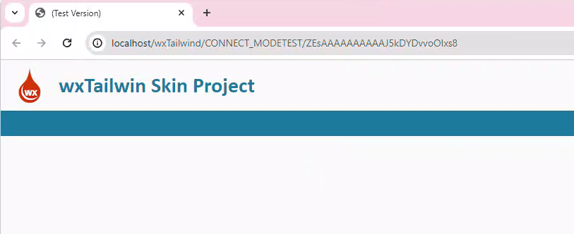
Creating the Master Page Template
I will name this template tplLaptopStackedMaster. Though lengthy, it’s necessary due to the number of example templates that will be included in the wxTailwind Skin project. In my production project, this template is just named tplMaster.
Begin on the page description, UI tab, and set the width to 1346 and the height to 675, as previously specified.

We also configure the anchoring to expand both horizontally and vertically with the browser.
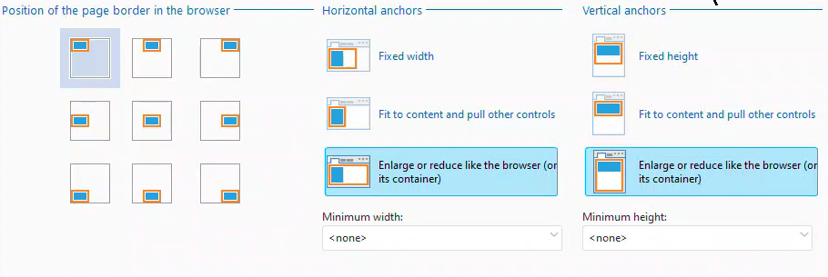
Since I am working on the wxTailwind Skin project, or if I were to use the wxTailwind skin in another project, we can assign the included WEBDEV style pageBasic as the page’s style.

It’s time to create the sections. I will create these sections as cells. I’ve experimented with using FlexBox, but I’ve found that cells still work best for these layout sections.
cellHeader
It is positioned at coordinates (0,0) and has dimensions of 1346 x 72.

Its anchoring expands horizontally with the browser and remains fixed vertically.
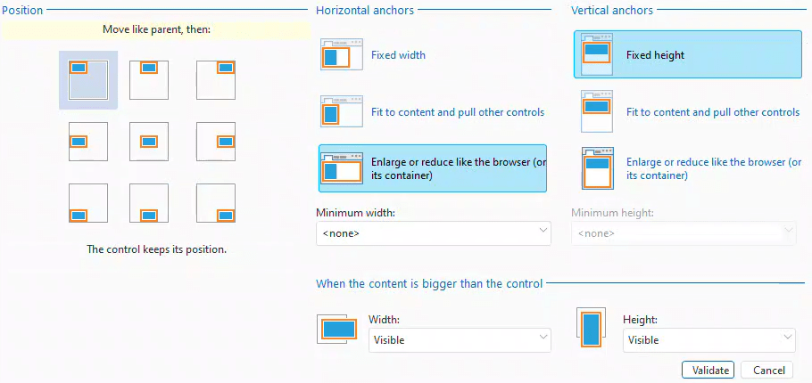
Since the wxTailwind skin doesn’t have any default styles for cells, all the settings are either blank, undefined, or inherited. This means we won’t have a border, and the cell will inherit the page’s background. If you’re using a different skin, you may need to adjust these settings as necessary.
cellMenu
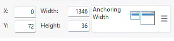
The menu bar is positioned at 0,72 and has dimensions of 1346 x 36. Its anchoring is the same as that of cellHeader.
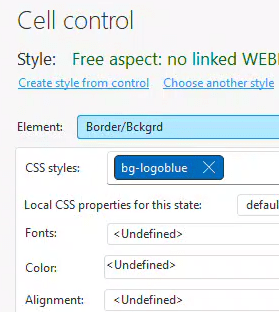
In the style tab, we apply the Tailwind class ‘bg-logoblue’. ‘logoblue’ is the custom color we’ve added to our Tailwind configuration file, and the ‘bg’ prefix sets it as the background color for this cell.
💡 If you haven't used the "logoblue" color in your project yet, it might not have been generated in the tailwind.css file. You can use the custom menu item, added in previous articles, to force a regeneration of this file. If the blue background for the cell still doesn't appear, try closing and reopening the page in the IDE. Usually, these steps refresh the display, but sometimes updates aren't visible until the project is reopened in the IDE. Some advanced Tailwind classes might not be reflected in the IDE but will render correctly. Get used to rendering your pages to see the final look. While we have near WYSIWYG, most web development frameworks nowadays are code-based, with visuals done via rendering.
cellHero
The content area of the page is located at coordinates (0,108) and measures 1346 x 565.
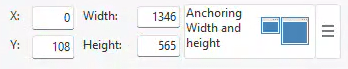
Unlike the other two sections, this one expands both horizontally and vertically with the browser.

Similar to cellHeader, it does not have its own styling and inherits the styling from the page.
That’s the fundamental layout of our page, consisting of three simple cells. In the future, we plan to add more elements to this template and use it as a base for other templates. For now, let’s proceed to add a logo and a site header line.
imgLogo
I’m using our wxPerts logo, which is 50×50 pixels. You might prefer to use your own logo. I’ve positioned it at 16,11. The X position of 16 follows a design rule that most elements should be separated by a standard unit. In this case, we’re using 16px, which is 1 standard em unit. The Y position is derived from vertically centering the logo in the 72px header.
stcSiteHeader
The Site Header is statically positioned at 82,18 with dimensions of 300 x 36. The X position is calculated as 16 + 50 + 16 = 82, providing 16 pixels of spacing. The Y position is straightforward vertical centering. In a future article, I will share a useful trick involving FlexBox that reduces the need for such calculations.
Before discussing the origin of the height value of 36, we need to add a few styles to the control: text-3xl, font-bold, and text-logoblue.

‘logoblue’ is our custom color, and when prefixed with ‘text’, it designates the text color. ‘font-bold’ is self-explanatory and ‘text-3xl’ is a standard font size class in Tailwind. According to the Tailwind CSS docs, ‘3xl’ equates to 1.875rem (30px) with a line height of 2.25rem (36px). This is how I determined the height of the static. The width of the static was set to 300 to ensure the text fits.
💡 Remember: If you haven't used these Tailwind classes yet, you'll need to manually regenerate Tailwind and likely refresh the page to see the changes. After you've completed the first few pages of your site, you'll have established a majority of the classes you'll be using and won't have to do this as frequently.
We now have a Master page template that fits on a low-end 15” laptop without scroll bars and scales up as necessary. Although it may not be the most exciting page yet, it serves as the foundation for many upcoming features.
Where’s the Footer?
You might be questioning the absence of a footer cell. After all, we need a spot for a copyright notice and possibly links to Privacy and Terms of Use, right? Originally, I had allocated a 24 pixel cell for this purpose.
However, after discussing the necessity of having the footer on every page with Gavin Webb, a significant contributor to this series, we concluded that there is no need to allocate those 24 pixels for a footer. The copyright notice, privacy, and terms of use links are only necessary on the first page of our application, which is the login site.
Alternative Layout 1
Continuing with the UI review that Gavin and I are conducting, Gavin strongly dislikes the use of 72 pixels for the header. While this design choice is justified in the production site it originated from, we agree that the current design trend favors reduced headers. Similar to our conclusion that a footer isn’t necessary, a larger branding impact is typically only needed on the first page.
I have added an alternative template called tplLaptopStackedMaster_Alt1. This version includes a header that is 36 pixels tall and a logo that is 24 pixels tall. The site header style ‘text-3xl’ has been replaced with ‘text-xl’, which equates to 1.25rem (20px) with a line height of 2rem (28px). I’ve used a 12-pixel spacing between the header and the site title, as smaller items look better with less spacing.
The net result is an additional 36 pixels of content height, as our Hero section is now 1346 x 601. This results in a site that preserves its branding while maximizing vertical space.

Alternative Layout 2
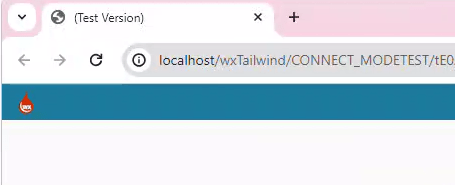
Taking this concept further, some web applications now opt for no site heading. My interpretation of this alternative is tplLaptopStackedMaster_Alt2. The logo has been moved into cellMenu, cellHeader and stcSiteHeader have been entirely removed. This maximizes the Hero section, which is now 1346 x 637. An alternative logo or no logo would likely enhance this version’s appearance.
What’s next
Gavin and I are considering an even more simplified layout I’ve named the “frameless” layout. However, we still need to sort out a few details before it’s ready for debut. Over the next few weeks, we’ll start adding other elements to our template, creating additional pages using this template, and exploring the “Uncle Pete” responsive looper and form techniques I’ve previewed on our Facebook group. This will involve substantial Flexbox and Grid CSS coverage, along with continued use of Tailwind CSS and much more!
In the meantime, if you’re interested in accessing the current state of the wxTailwind project, you can do so using this Dropbox link: https://www.dropbox.com/scl/fi/z4fqzm21jjb923j19p8ao/wxTailwind.ZIP?rlkey=cl58ihuidi2vq0ovbxqpxqnkf&dl=0
 wxBlog - All things wx – Covering pcSoft products (WINDEV, WEBDEV, WINDEV Mobile)
2 thoughts on “The Laptop First Stacked Layout”