
I have always struggled with the built-in WEBDEV message and dialog boxes. Their styling tends to break at some point during a project’s lifespan, and they never quite do what I want, so I generally create my own. After working on our current project for several months, I decided it was time to create a formal management system for these popups.
As you’ll see, I’m using Tailwind CSS with these popups, though you can easily adapt them to standard CSS. The popup screens themselves are straightforward—the real magic happens in the classes and procedures that manage them. This isn’t a 100% complete solution; I’ve been developing it over the last few months as needed for the current project. While it hasn’t gone into production yet, and we’ll likely need other variations as development continues, this should give you a solid foundation to build upon.
If you want to use my Tailwind examples, you’ll need to configure WEBDEV as I have. Please check out the following articles that discuss Tailwind CSS
- WEBDEV meets Tailwind CSS
- Dipping our WEBDEV toe into the Tailwind CSS pool
- Evidence that Tailwind CSS could be the droids we are looking for!
- Font Icons 3: This time it’s about SVG
- The Laptop First Stacked Layout
- Tablet First Layout with WEBDEV and Tailwind CSS. No CSS Grid. No Flexbox. No JavaScript.
The Page Template and Popup Screens
The first thing we need is a set of popup screens accessible from every page of our site. The simplest way to achieve this is by adding them to the master page template. Following my design philosophy, I recommend creating a master page template containing your website’s basic structure and look-and-feel. You can then base specific page templates on this master template if you need variations for different sections of the site. This approach means that any changes we make to the master template automatically flow down to every page of the site, making tasks like this much simpler. For our purposes, we need to add three popups to our master page template.
popwxToast

As the name implies, this popup displays toast messages. It contains a rich text control for displaying a Font Icon (be sure to see the article linked above), a static control for showing the actual message, and a button that lets users close the screen instead of waiting for it to time out.
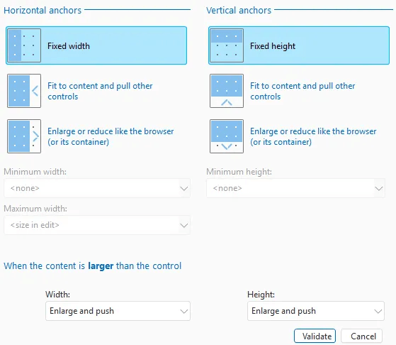
The popup screen itself has no styling or anchoring
The project explorer shows several additional controls that are part of this setup.

The rich text control, static control, and button are contained inside a Flexbox control, which controls their positioning based on the message size. There are also two HTML controls outside the Flexbox that initially contain nothing but are later used to insert HTML for controlling the popup’s position in certain situations.
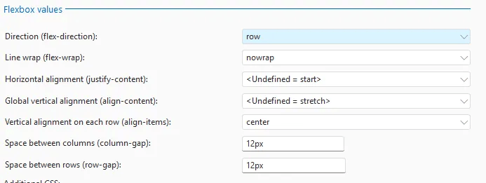
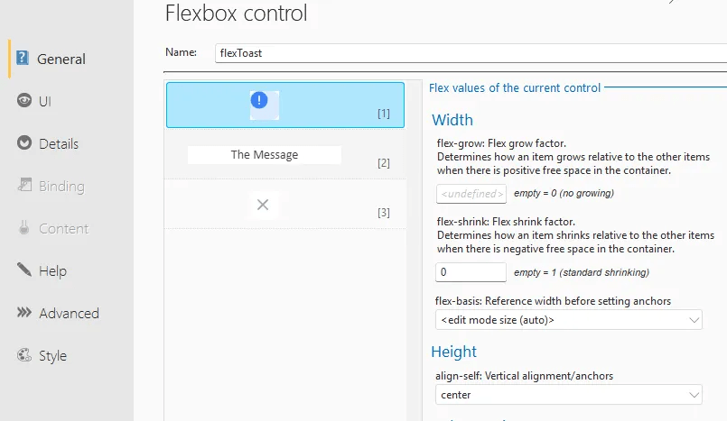
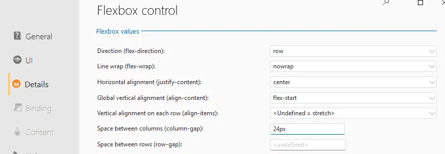
The Flexbox control uses row direction without line wrapping. Its horizontal alignment is set to the default “start”, while the global vertical alignment uses the default “stretch.” Each row’s vertical alignment is set to “center,” with 12px spacing between both columns and rows.
Anchoring is set to enlarge like the container horizontally, and fit/pull vertically.
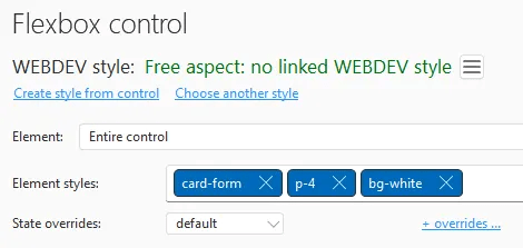
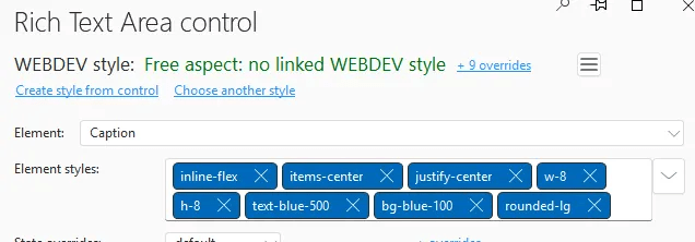
There are 3 Tailwind classes assigned to the Flexbox control
The rich text control which holds the font icon uses the default of no growing and is set to no shrinking and centered.
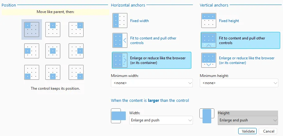
The static control that holds the message is set to grow while maintaining the default shrinking and flex-start height. This allows the popup to adjust to any message size while keeping the font icon and button properly sized and positioned. Flexbox proves incredibly useful once you grasp its concepts.

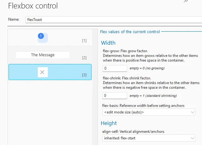
Finally our button is setup with no growing or shrinking and uses flex-start for the height.
The rich text control doesn’t have any special anchoring.
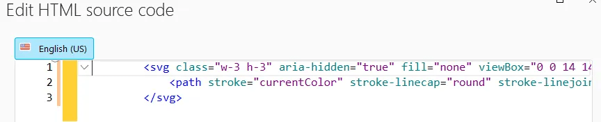
I’ve placed one of the possible font icons in the control to make the display closer to WYSIWYG, though it’s not perfect since WEBDEV doesn’t fully render my Tailwind CSS.

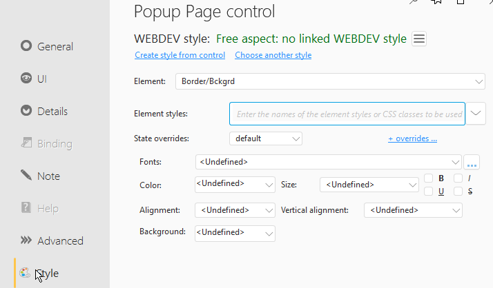
Styling is a crucial aspect of this control. As covered in the articles referenced above, when using Tailwind CSS, I set all WEBDEV styling options to undefined. Instead, we implement several Tailwind classes to handle the styling.
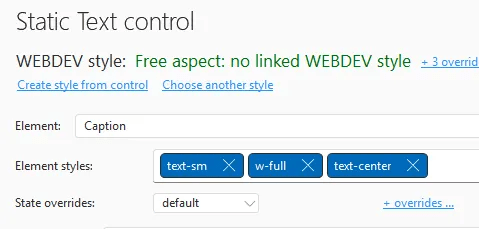
I’ve set “The Message” as placeholder text in the static control, which provides a visual reference during design. The anchoring is configured to grow or shrink to fit the space horizontally and to adapt to the content vertically.

There are only 3 Tailwind classes required for the static
The button has no special anchoring, and I’ve used a font icon to display an X as the close button
Again, there are quite a few Tailwind classes assigned

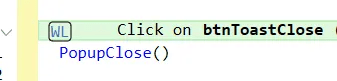
We also need to add the browser code to the button to close the popup
The two HTML controls are initially empty, with one placed above the Flexbox control and one below. Neither has special anchoring. Their purpose will become clear later.
One popup down, two to go!
popwxPop

As the name suggests, this popup is used for basic popup messages. You’ll notice it looks very similar to our Toast version, with the main difference being a standard-style button instead of just an “X”.
The popup uses two FlexBox controls—one containing our font icon and message, the other containing our close button. I could potentially simplify this using CSS Grid instead of two FlexBox controls, but when I created this popup, I understood FlexBox better than Grid. Now I’m hesitant to change it since it works so well! 🙂

As you can see, we still have the two HTML controls at the top and bottom. You’ll also notice a cell control that contains the two Flexbox controls. This cell is necessary for styling the popup—due to a known issue where Tailwind styling doesn’t get applied directly to popups (which I’ve reported to PCSOFT). The cell lets us apply styling that would normally go on the popup itself. In the first popup, we applied this styling to the Flexbox control since it was the only one.
The cell has no special anchoring and simply contains our two Flexbox controls with two Tailwind classes assigned

Our first Flexbox contains the rich text for the font icon and the static message. Its anchoring is set to enlarge horizontally like the container and fit/pull vertically—the same as the Flexbox in our first popup. It uses row direction without line wrapping. The horizontal alignment uses the default “start,” while the global vertical alignment uses the default “stretch.” Each row’s vertical alignment is set to “center” with 12px spacing between both columns and rows.
It has one Tailwind CSS class assigned

The flex settings, anchoring, and styling for both the rich text and static controls match those of the first popup’s Flexbox exactly.
The second Flexbox, which contains the Close button, uses default anchoring and has two Tailwind classes

The flex settings again use row direction with no wrap. The horizontal alignment is set to center, and the global vertical alignment is flex-start. Since there is only one control, we don’t need to specify individual row alignment or spacing.

The button has no special anchoring and one Tailwind class assigned

This is a custom Tailwind class I created in my input-tailwind.css file, which is covered in one of the articles referenced at the beginning of this article. It looks like this
	.btn-primary {
		@apply text-lg text-white font-semibold;
		@apply rounded-md shadow-sm bg-logoblue hover:bg-blue-500;
		@apply transition;
		@apply focus-visible:outline focus-visible:outline-2 focus-visible:outline-offset-2 focus-visible:outline-blue-700;
	}
The close button’s code is slightly different. In addition to closing the popup, it calls a callback procedure, which we’ll explore later.

Two down, one to go!
popwxYesNo

As you might guess, this popup implements a Yes/No dialog 🙂. It’s very similar to our popwxPopup, with one key difference: the second Flexbox control contains two buttons instead of one.

The popup has identical anchor and style settings as before. The cell configuration and all settings for the first Flexbox control—including its rich text and static elements—remain the same.
The only difference lies in the second Flexbox control. While it shares the same anchoring and style settings as our previous second Flexbox control, we’ve added 24 pixels of column spacing to separate the two buttons.
Both buttons are set to the same no growing, no shrinking settings

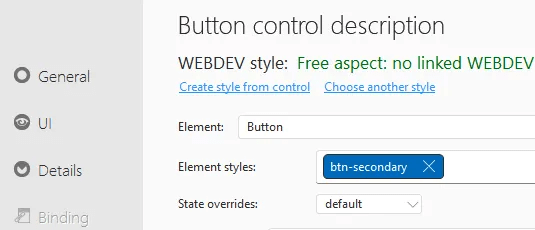
The No button is assigned another custom Tailwind class, this time btn-secondary
	.btn-secondary {
		@apply text-lg text-logoblue font-semibold;
		@apply rounded-md shadow-sm bg-white hover:bg-blue-100;
		@apply border border-solid border-logoblue;
		@apply transition;
		@apply focus-visible:outline focus-visible:outline-2 focus-visible:outline-offset-2 focus-visible:outline-blue-700;
	}
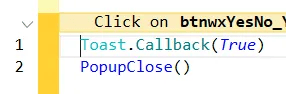
The No button’s code calls the callback procedure with a false parameter

The Yes button uses the same btn-primary class as our close button above, and its code calls the callback procedure with a true parameter
With our three popups now created and configured, we have completed all the necessary changes to the master page template.
wxToast Class
Now for the real magic: a manager class! As you might guess, we’re quite fond of our classes here at wxPerts 😊
Declaration
wxToast is a Class

	//Toast Defaults
	ToastVerticalDefault is int = vaMiddle
	ToastHorizontalDefault is int = haCenter
	ToastTopOffSet is int = 0
	ToastBottomOffSet is int = 0

	//Popup Defaults
	PopupDisplayOptions is int = popupCenter
	PopupTopOffSet is int = 0
	PopupBottomOffSet is int = 0

	// Message Styles
	Information is int = 0 , immuable
	Success is int = 1 , immuable
	Warn is int = 2 , immuable
	Err is int = 3 , immuable

	// Callback procedure used by YesNo and PopupModal
	Callback is procedure
GLOBAL

	InformationBackground is int = RGB(219,234,254)
	InformationIcon is string  = [
		<svg style="color:rgb(59,130,246);width:1.25rem;height:1.25rem;" aria-hidden="true" fill="currentColor" viewBox="0 0 20 20">
		<path d="M10 .5a9.5 9.5 0 1 0 9.5 9.5A9.51 9.51 0 0 0 10 .5ZM10 15a1 1 0 1 1 0-2 1 1 0 0 1 0 2Zm1-4a1 1 0 0 1-2 0V6a1 1 0 0 1 2 0v5Z"/>
		</svg>
	]

	SuccessBackground is int = RGB(220,252,231)
	SuccessIcon is string = [
		<svg style="color:rgb(34,197,94);width:1.25rem;height:1.25rem;"  aria-hidden="true" fill="currentColor" viewBox="0 0 20 20">
		<path d="M10 .5a9.5 9.5 0 1 0 9.5 9.5A9.51 9.51 0 0 0 10 .5Zm3.707 8.207-4 4a1 1 0 0 1-1.414 0l-2-2a1 1 0 0 1 1.414-1.414L9 10.586l3.293-3.293a1 1 0 0 1 1.414 1.414Z"/> 0 0 1 2 0v5Z"/>
		</svg>
	]

	WarnBackground is int = RGB(255,237,213)
	WarnIcon is string = [
        <svg style="color:rgb(249,115,22);width:1.25rem;height:1.25rem;" aria-hidden="true" fill="currentColor" viewBox="0 0 20 20">
            <path d="M10 .5a9.5 9.5 0 1 0 9.5 9.5A9.51 9.51 0 0 0 10 .5ZM10 15a1 1 0 1 1 0-2 1 1 0 0 1 0 2Zm1-4a1 1 0 0 1-2 0V6a1 1 0 0 1 2 0v5Z"/>
        </svg>
	]

	ErrBackground is int = RGB(254,226,226)
	ErrIcon is string  = [
        <svg style="color:rgb(239,68,68);width:1.25rem;height:1.25rem;" aria-hidden="true" fill="currentColor" viewBox="0 0 20 20">
           <path d="M10 .5a9.5 9.5 0 1 0 9.5 9.5A9.51 9.51 0 0 0 10 .5Zm3.707 11.793a1 1 0 1 1-1.414 1.414L10 11.414l-2.293 2.293a1 1 0 0 1-1.414-1.414L8.586 10 6.293 7.707a1 1 0 0 1 1.414-1.414L10 8.586l2.293-2.293a1 1 0 0 1 1.414 1.414L11.414 10l2.293 2.293Z"/>
        </svg>
	]
END
First, we set up some defaults for both toast and popup displays. We then define several immutable integers (similar to equates but I have had issues with them at times, so I use immutable variables instead) that control which of the four font icon types is displayed.
There’s also a Callback variable declared as a procedure, which we’ll explore later.
In the GLOBAL section, we declare the background colors and SVG code for each of the four font icons. Since these are global, you can override them to apply changes across every instance of the class.
The class includes several methods for displaying Toast and Popup Messages. I’ve kept the method calls similar to the native ones to minimize code changes when switching to this solution.
Display
PROCEDURE Display(MessageText,LOCAL Style is int = Information,Duration is int = toastShort,Vertical is int = ToastVerticalDefault,Horizontal is int = ToastHorizontalDefault,TopOffset is int = ToastTopOffSet,BottomOffSet is int = ToastBottomOffSet)

{"popwxToast.stcToastMessage",indControl} = MessageText
{"popwxToast.stcToastIcon",indControl}..CaptionHTML = getIcon(Style)
{"popwxToast.stcToastIcon",indControl}..BackgroundColor = getBackground(Style)
{"popwxToast.htmlToastTopOffset",indControl} = "<div Style='height: [%TopOffset%]px;'></div>"
{"popwxToast.htmlToastBottomOffset",indControl} = "<div Style='height: [%BottomOffSet%]px;'></div>"
ToastDisplayPopup({"popwxToast",indControl},Duration,Vertical,Horizontal)
This procedure displays a toast message using indirection to prevent compile errors. The ToastDisplayPopup function allows a popup to be shown as a toast notification. Most parameters are optional and use the default values defined in the declaration section. We’ll explore how to use this and other methods in more detail later.
Popup
PROCEDURE Popup(MessageText,LOCAL Style is int = Information,DisplayOptions is int = PopupDisplayOptions,x is int = 0, y is int = 0,TopOffset is int = PopupTopOffSet,BottomOffSet is int =PopupBottomOffSet)

Callback = Null
{"popwxPop.stcPopMessage",indControl} = MessageText
{"popwxPop.stcPopIcon",indControl}..CaptionHTML = getIcon(Style)
{"popwxPop.stcPopIcon",indControl}..BackgroundColor = getBackground(Style)
{"popwxPop.htmlPopTopOffset",indControl} = "<div Style='height: [%TopOffset%]px;'></div>"
{"popwxPop.htmlPopBottomOffset",indControl} = "<div Style='height: [%BottomOffSet%]px;'></div>"
PopupDisplay({"popwxPop",indControl},DisplayOptions+popupDiscardable,x,y)
This displays the popup, which is very similar to the Toast version but uses PopupDisplay instead. It sets the Callback variable to Null as a safeguard in case it was previously assigned and not cleared. The PopupDisplay call uses the popupDiscardable option, which means the popup will automatically close if the user hits the escape key or clicks outside it. This makes it ideal for informational messages where you want users to see the content but not force them to take action—essentially one step above a toast notification, which closes automatically after a time delay.
PopupModal
PROCEDURE PopupModal(MessageText,inCallBack is procedure,LOCAL Style is int = Information,DisplayOptions is int = PopupDisplayOptions,x is int = 0, y is int = 0,TopOffset is int = PopupTopOffSet,BottomOffSet is int =PopupBottomOffSet)

Callback = inCallBack
{"popwxPop.stcPopMessage",indControl} = MessageText
{"popwxPop.stcPopIcon",indControl}..CaptionHTML = getIcon(Style)
{"popwxPop.stcPopIcon",indControl}..BackgroundColor = getBackground(Style)
{"popwxPop.htmlPopTopOffset",indControl} = "<div Style='height: [%TopOffset%]px;'></div>"
{"popwxPop.htmlPopBottomOffset",indControl} = "<div Style='height: [%BottomOffSet%]px;'></div>"
PopupDisplay({"popwxPop",indControl},DisplayOptions+popupFixed,x,y)
This version is modal, which means the user must click the button to close the popup and continue. The popupFixed option on the PopupDisplay function enforces this behavior. The version requires a Callback procedure. I use this approach when I want to perform an action but need to pause and inform the user first. By placing the action code in the Callback procedure, it won’t execute until the user clicks the button.
YesNo
PROCEDURE YesNo(MessageText,inCallBack is procedure,DisplayOptions is int = PopupDisplayOptions,x is int = 0, y is int = 0,TopOffset is int = PopupTopOffSet,BottomOffSet is int =PopupBottomOffSet)

Callback = inCallBack

{"popwxYesNo.stcPopMessage",indControl} = MessageText
{"popwxYesNo.htmlPopTopOffset",indControl} = "<div Style='height: [%TopOffset%]px;'></div>"
{"popwxYesNo.htmlPopBottomOffset",indControl} = "<div Style='height: [%BottomOffSet%]px;'></div>"
PopupDisplay({"popwxYesNo",indControl},DisplayOptions+popupFixed,x,y)
Like the PopupModal version, but this displays two buttons—Yes and No—for user interaction.
getIcon
PROCEDURE PRIVATE getIcon(Style)

SWITCH Style
	CASE 0 //Information
		RESULT InformationIcon
	CASE 1 // Success
		RESULT SuccessIcon
	CASE 2 // Warning
		RESULT WarnIcon
	CASE 3 // Error
		RESULT ErrIcon
	OTHER CASE
		dbgAssert(False,"Unknown Style="+Style)
		RESULT ""
END
Returns the appropriate SVG code based on the provided style parameter. This is a private method, accessible only within the class.
getBackground
PROCEDURE PRIVATE getBackground(Style)

SWITCH Style
	CASE 0 //Information
		RESULT InformationBackground
	CASE 1 // Success
		RESULT SuccessBackground
	CASE 2 // Warning
		RESULT WarnBackground
	CASE 3 // Error
		RESULT ErrBackground
	OTHER CASE
		dbgAssert(False,"Unknown Style="+Style)
		RESULT ""
END
Similar to getIcon, this method returns the appropriate background color based on the style parameter.
That covers all the functionality in this class. Next, let’s look at the global browser procedures we need to declare.
Global Browser Procedures
setYesNoButtonClasses
PROCEDURE setYesNoButtonClasses(yesClass is string = "btn-primary",noClass is string = "btn-secondary")

RemoveButtonClasses()
jQuery("#BTNWXYESNO_YES").addClass(yesClass)
jQuery("#BTNWXYESNO_NO").addClass(noClass)
This function allows you to swap the button styling by changing their CSS classes. By default, the Yes button uses the btn-primary class and the No button uses btn-secondary, but you can reverse this priority or apply entirely different classes to either button.
RemoveButtonClasses
function RemoveButtonClasses()
{
$('[id^=BTNWXYESNO]').removeClass (function (index, className) {
    return (className.match (/(^|\\s)btn-\\S+/g) || []).join(' ');
});
}
This procedure is called from setYesNoButtonClasses to remove existing button classes before adding new ones. Note that this uses JavaScript code rather than WL browser code.
We also need to create a global server procedure next
Global Server Procedures
wxToastDisplay
PROCEDURE wxToastDisplay(MessageText,LOCAL Style is int = Toast.Information,Duration is int = toastShort,Vertical is int = Toast.ToastVerticalDefault,Horizontal is int = Toast.ToastHorizontalDefault,TopOffset is int = Toast.ToastTopOffSet,BottomOffSet is int = Toast.ToastBottomOffSet)

Toast.Display(MessageText,Style,Duration,Vertical,Horizontal,TopOffset,BottomOffSet)
Since this class is server code, we can’t call it directly from the browser. This procedure allows us to make calls through AJAXExecute instead.
Now that we have all the components defined, let’s look at some examples!
Examples
Remember that our class is just a definition—we need to declare an actual instance to use it. For this site, I am using the same settings throughout, so I declare my instance in the project’s global declarations. You could alternatively do this on a page template or even on individual pages if needed.
<COMPILE IF ConfigurationType=Site>
	Toast is wxToast
	Toast.ToastHorizontalDefault = haCenter
	Toast.ToastVerticalDefault = vaTop
	Toast.PopupDisplayOptions = popupTopCenter
	Toast.ToastTopOffSet = 20
<END>
Notice I have set the Toast defaults to be centered horizontally and positioned at the top vertically, with a Top Offset of 20 pixels to prevent it from touching the top of the page. I have also configured the Popup to display by default in the Top Center position.
Toast
In this simplest example called from server code, we only need to provide the message to display. All other parameters use their default values.
Toast.Display("This is an example Toast Message")
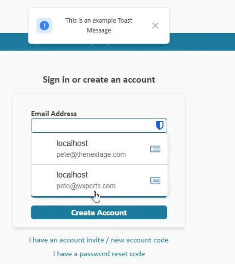
Notice that the information icon appears by default when no style is specified.
When displaying a Toast from browser code, we cannot directly access the server class. Instead, we must call our wxToastDisplay global server procedure, which is automatically executed via AJAXExecute (indicated by the double arrow symbol).

All parameters are identical between the class and server versions of the call, except for one difference: since we cannot reference server variables declared in the class from browser code, we must pass the style as integers (0, 1, 2, 3) instead of using Information, Success, Warn, Err.
In our next example, we’ll call from server code to display an error icon and make the toast appear for a longer duration
Toast.Display(retError,Toast.Err,toastLong)
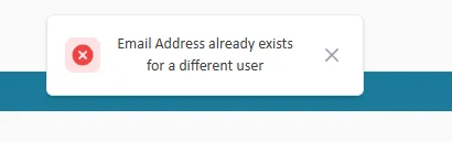
Here’s a similar example called from browser code. Note that we must use the wxToastDisplay procedure and pass the style as the number 3 rather than Toast.Err
wxToastDisplay("Email Address is Required",3,toastLong)
The function accepts several additional parameters that match the native Toast function’s parameters, including vertical and horizontal positioning and top/bottom offsets. You can customize these values to override your global defaults for specific toast displays. While I haven’t needed to use these optional parameters yet, their purposes are straightforward.
Popup
As mentioned earlier, this is a discardable popup that works similarly to the Toast call. While I haven’t needed to call it from browser code, creating a global server procedure for this would be straightforward if necessary.
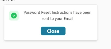
In this example, I’m displaying the popup with a success font icon and center positioning
Toast.Popup("Password Reset Instructions have been sent to your Email",Toast.Success,popupCenter)
Additional parameters match those of the native function, including options to adjust the top and bottom offset. While I haven’t needed these parameters in this project, they remain available for future use.
PopupModal
As discussed earlier, this modal version of the popup cannot be dismissed and has an associated action. In this example, I notify users that their application has been submitted, but I want them to click the button before redirecting them to the site’s main page.
First, I declare a local server procedure called BackToMain. As you’ll see, this procedure contains only a PageDisplay function
PROCEDURE BackToMain()

PageDisplay(Main)
In the code that processes a successful application, I call the method and pass the procedure name as the callback parameter. As established when we coded the button, it executes this procedure when it exists.
Toast.PopupModal("Your application has been submitted and you will be notified as it is reviewed",BackToMain,Toast.Information)

Otherwise, this version functions identically to the discardable version.
YESNO
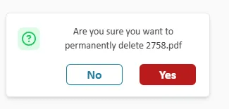
Now we get into the feature that really prompted me to create all of this. I have always struggled with the built-in YESNO functions. In this example, when a user clicks the delete button for a document, I want to confirm they really want to delete it before proceeding.
I create a server procedure called ConfirmDeleteDocument that accepts a boolean parameter. When we coded the Yes and No buttons above, we pass True or False back to the callback procedure—this is the other half of that functionality.
PROCEDURE ConfirmDeleteDocument(Confirmed is boolean)

IF Confirmed
	IF NOT recPaxx.mgrDocument.SaveRecord(recDocument,recDocument.DocumentID,EQU.eDelete,retError) THEN
		Toast.Display(retError,Toast.Err,toastLong)
	ELSE
		LooperDisplay(loopDocument,taCurrentSelection)
		cellPlane4.Plane = 1
	END
END
If they click Yes, we delete the document. If the deletion fails, we show an error via our Toast Display method. Otherwise, we refresh the looper and return to the display. If they click No, no action is taken.
In the browser event before the server code, we’ll call our setYesNoButtonClasses procedure. I want the Yes button to be red to signify an irreversible action, while the No button will remain the secondary button.
setYesNoButtonClasses("btn-primary-red","btn-secondary")
Finally, our server code for the button calls the YesNo function, passing in the ConfirmDeleteDocument procedure as the callback and displaying the popup in a centered position.
IF recDocument.DocumentID = 0 THEN
	cellPlane4..Plane = 1
ELSE
	Toast.YesNo("Are you sure you want to permanently delete [%recDocument.Filename%]",ConfirmDeleteDocument,popupCenter)
END
Wrap up / What’s to come?
While this isn’t a complete solution yet—these are just the use cases I’ve needed and created so far—I’m sure I’ll eventually need other generic dialogs to add. If you implement this and create additional dialogs before I do, please share them with the rest of us!
 wxBlog - All things wx – Covering pcSoft products (WINDEV, WEBDEV, WINDEV Mobile)
Awesome! It would be nice to have a test project as an example
LikeLike
Unfortunately I have been developing this in a production application, and have not had time to build an example application, and in it’s current form you would need to be using my Tailwind CSS modifications to even use the example application, unless I do the work to rework everything without Tailwind CSS, which I just don’t have time to do at the moment and really would not want to do until this solution is a little closer to complete. This article, as most of our articles, was actually created as semi documentation for one of our other consulting clients wishing to implement the solution in their application.
LikeLike