
A bug in the Link control that causes issues with captions containing accented characters can be resolved by changing the links to buttons. This workaround involves selecting the Link Control, choosing “Refactoring and swapping” on the Modification tab, and selecting Button/Link from the switch section. Additionally, using buttons instead of links provides more control over design and functionality, including the ability to use HTML captions and Icon Fonts.
Link Caption Bug
Brian Holmes provided information about a problem he encountered with the Link control, specifically when captions contain accented characters, which are common in French and Spanish. He created a sample project demonstrating the issue, which he has submitted to support. The issue has since been referred to the programming team.
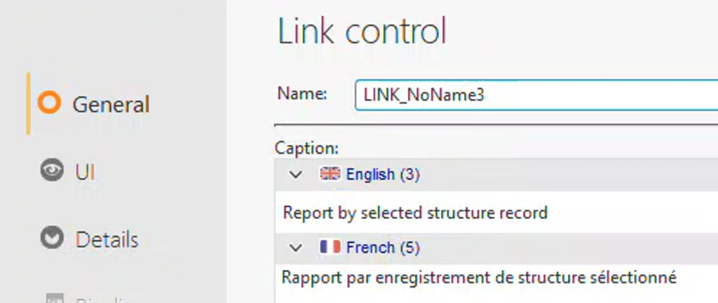
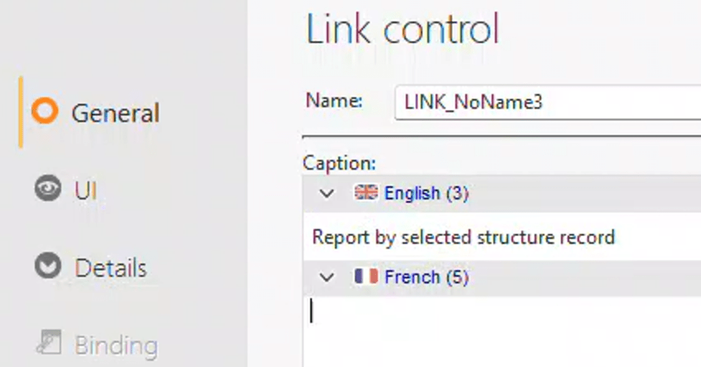
This issue manifests in two ways. To observe this behavior, create a link control that includes both an English and a French caption. For instance, use “Report by selected structure record” in English and “Rapport par enregistrement de structure sélectionné” in French.
When the site is displayed in English, the link is visible.
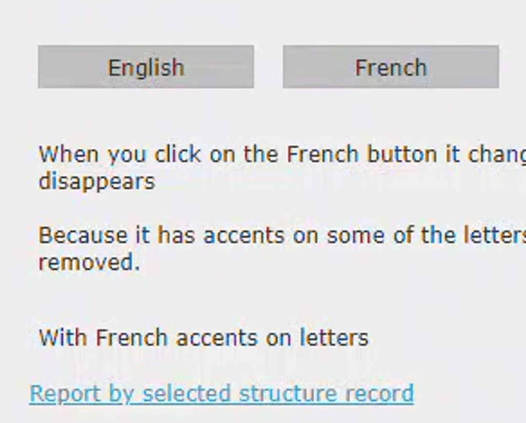
However, as soon as the site is switched to French, the link disappears.
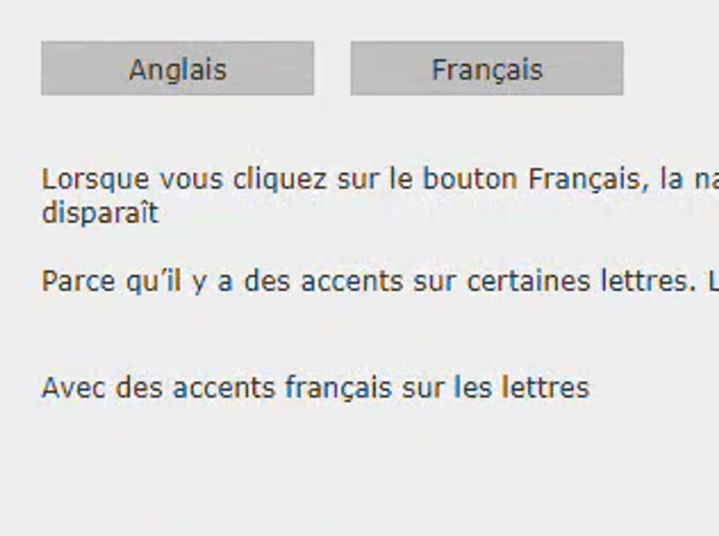
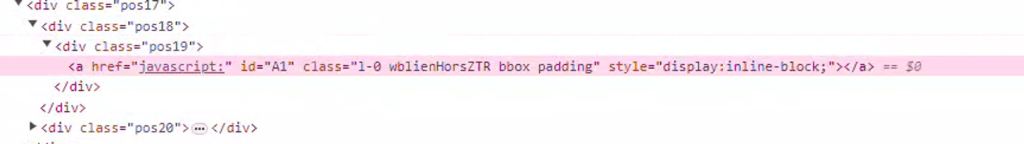
Technically, it isn’t gone. It simply doesn’t have any text for the caption, which can be observed by examining the resulting HTML.
The second issue arises when we close and then reopen the page in the IDE. It appears that the French caption is no longer on the control. However, the caption is still there, it’s just not being displayed, as we’ll see shortly.
The Work Around
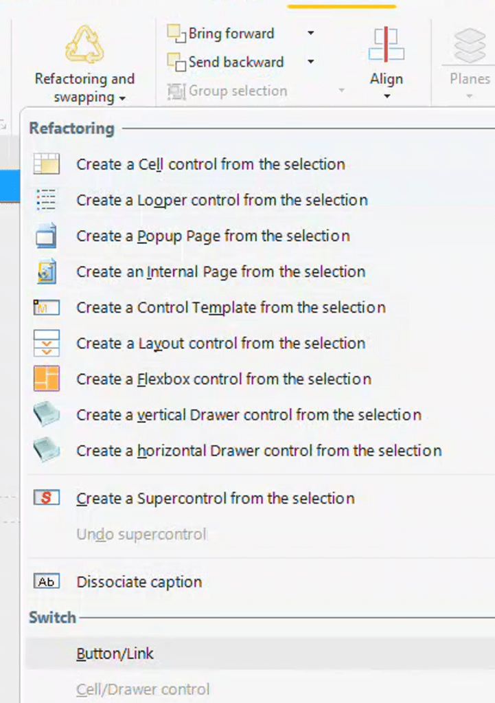
There is a simple workaround for this problem. In fact, Brian messaged me this morning to say he’s already applied this solution on his site. Just change the links to buttons. That’s the entire process, and it’s easy to do since PCSOFT has provided us with a tool for this purpose.
- Select the Link Control
- On the Modification tab of the ribbon bar, select “Refactoring and swapping”
- Choose Button/Link from the switch section
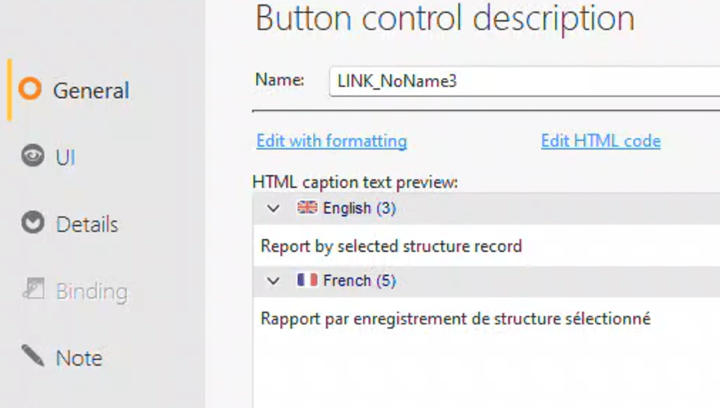
Upon examining the description of the control, you will find it is now a Button control. Even better, our French caption has returned with all its accented glory! A test of the site will also confirm that the French caption is displayed correctly.
You can create a WEBDEV style for your “Buttons as Links”. This can be as innovative as you desire. I often style my links to only display the underline when hovered over or to have a slight glow, among other effects. Here are the fundamental steps to make it behave similarly to its original link form.
Clearly, we don’t want any images for the button. In fact, I tend to avoid using images for buttons, even for those that are intended to look like buttons.
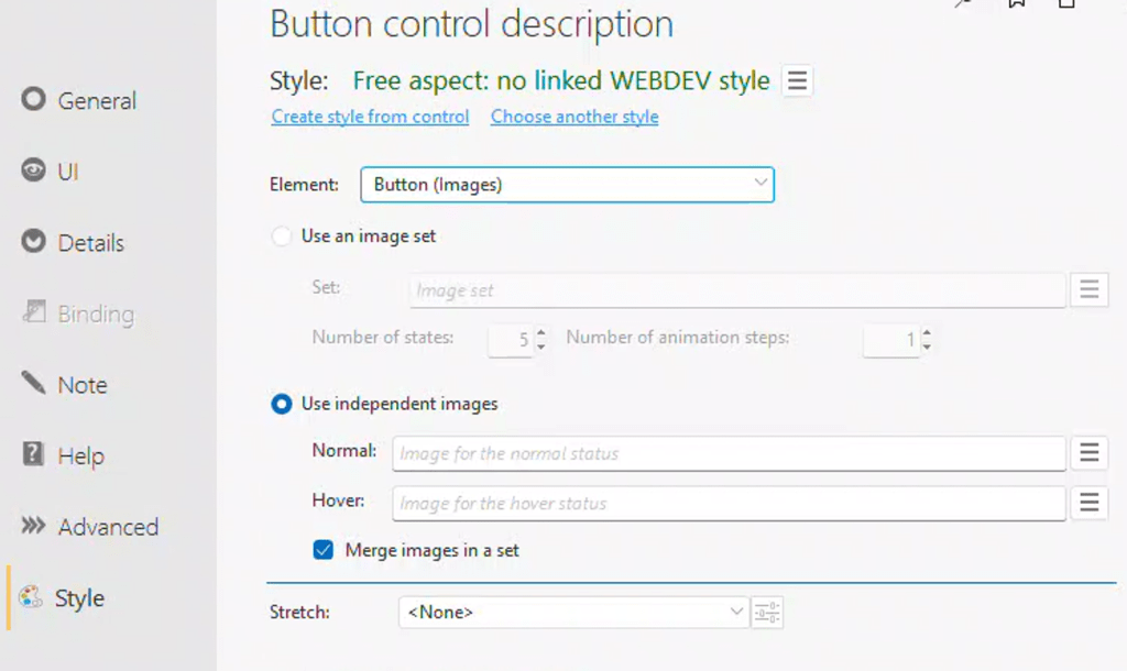
For the basic CSS settings of the button, we don’t want any border or background. Note: these settings are where I style the buttons I want to look like buttons as well. That way, they are pure CSS and do not require any graphics.
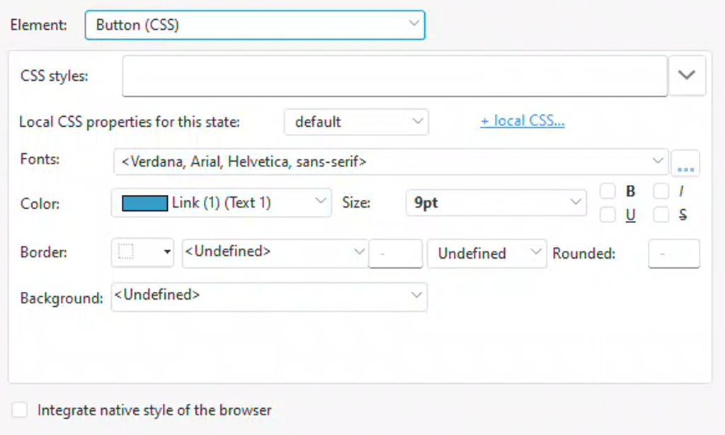
Now we delve into the “+ local CSS…” section, ironically represented here as a link. We start by defining how we want the link to appear in its default state. For example, we set the Alignment to Left, and the Decoration to Underline (this can be set to None if we only want the underline to appear when hovered over). The Font, Size, and Color were already configured on the basic settings screen.
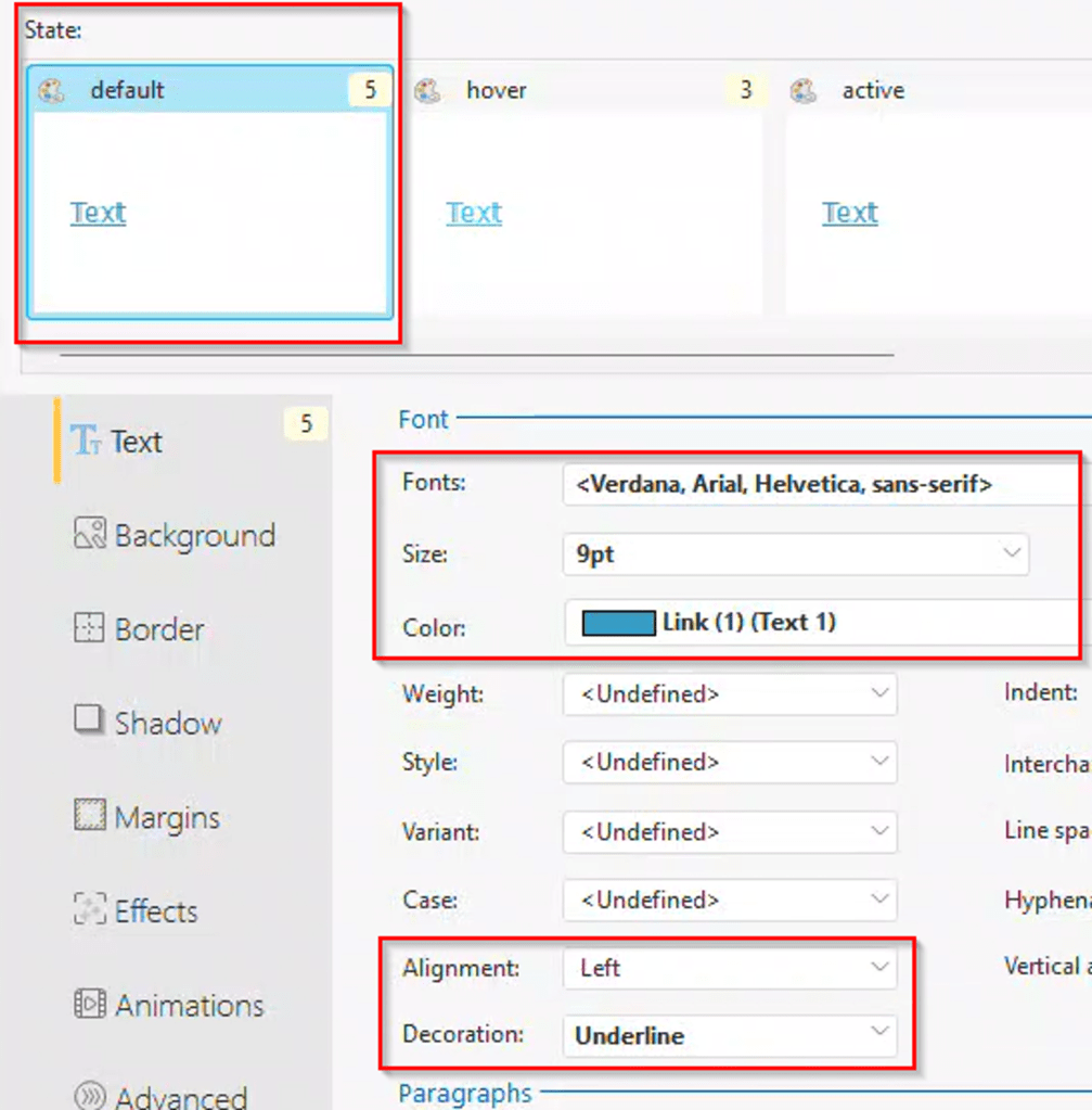
Note that we don’t set anything related to background, border, etc., as our aim is to replicate a normal link.
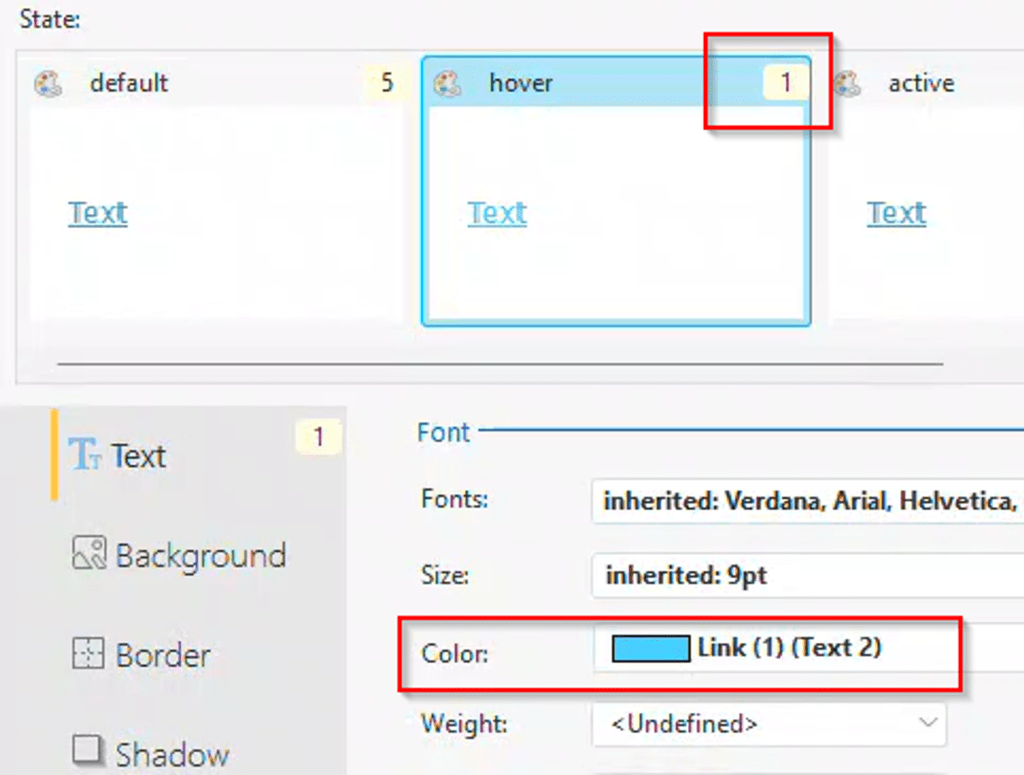
For the hover state, we only need to set one override by changing the color to Link (1) (Text 2). All other settings should be set to inherited or undefined, which allows them to use the values from the default state. The interface indicates how many settings are changed for each state.
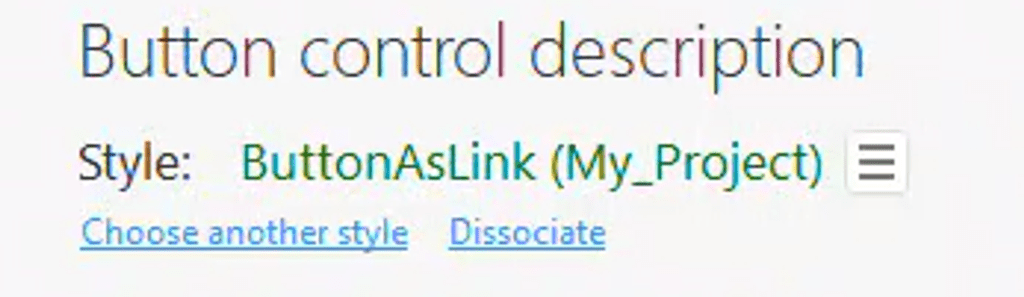
Now, click the ‘OK’ button to return to the main screen of the style settings. Select the ‘Create style from control’ option, and assign it an appropriate name. We can not apply this style to all the other links we converted to buttons. Going forward, we will only create buttons using our new style, rather than links.
So Why are Links so Damn Evil in the First Place?
Gavin Webb and I recently discussed web and interface design, with a particular focus on implementing modern features from other sites into WEBDEV. We realized that we consistently use buttons instead of link controls. It’s been so long since we made that decision, we had almost forgotten why. Brian’s email prompted me to reflect on our reasoning.
Links have associated behaviors at the browser level
Page-level style settings exist to set the default color for links, as well as their active or visited states and their default underline behavior. These settings can also be overridden by users’ browser settings. There are accessibility concerns with this link behavior. If I were creating a content site, I might prioritize these concerns. However, in business applications, the behavior of navigation and action controls often helps convey their functionality and importance. In these cases, I want full control over them.
No support for HTML captions
I believe this is the root issue causing the bug with accent characters on links. I suspect internally the control isn’t supporting special characters because it is expecting simple text.
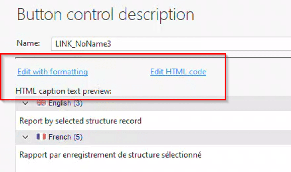
The lack of HTML support is significant to me. Upon comparing the description windows of the link control and the button control, you’ll notice a few variations. Two additional options appear: “Edit with formatting” and “Edit HTML code”. Instead of merely “caption”, the label now reads “HTML caption text preview”. This is because buttons fully support HTML for their captions.
However, the real game changer for me is the ability to use HTML, which allows me to use Icon Fonts for my captions. I’ve discussed Icon Fonts several times before, and I plan to revisit the topic in a future article, as a lot has changed since those discussions.
If you are not using Icon fonts you are missing out! All those little add, change, delete graphics as well as navigation graphics are a pain to maintain, color, size, etc. And they also add to the load of your site. Icon fonts as the name implies are just that fonts, so sizing and coloring is the same as any other text, as once the browser has cached the font file, there is a considerable reduction in your site load. And besides it is what all the cool kids are using 😊
If you’re not using icon fonts, you are missing out! With traditional graphics, maintaining color and size consistency can be challenging, and they can add to your site’s load time. Icon fonts, as the name suggests, are treated like fonts. This makes altering their size and color as easy as for text. Once the browser has cached the font file, your site’s load time can decrease significantly. Plus, it’s what all the cool kids are doing. 😊
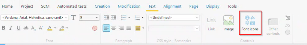
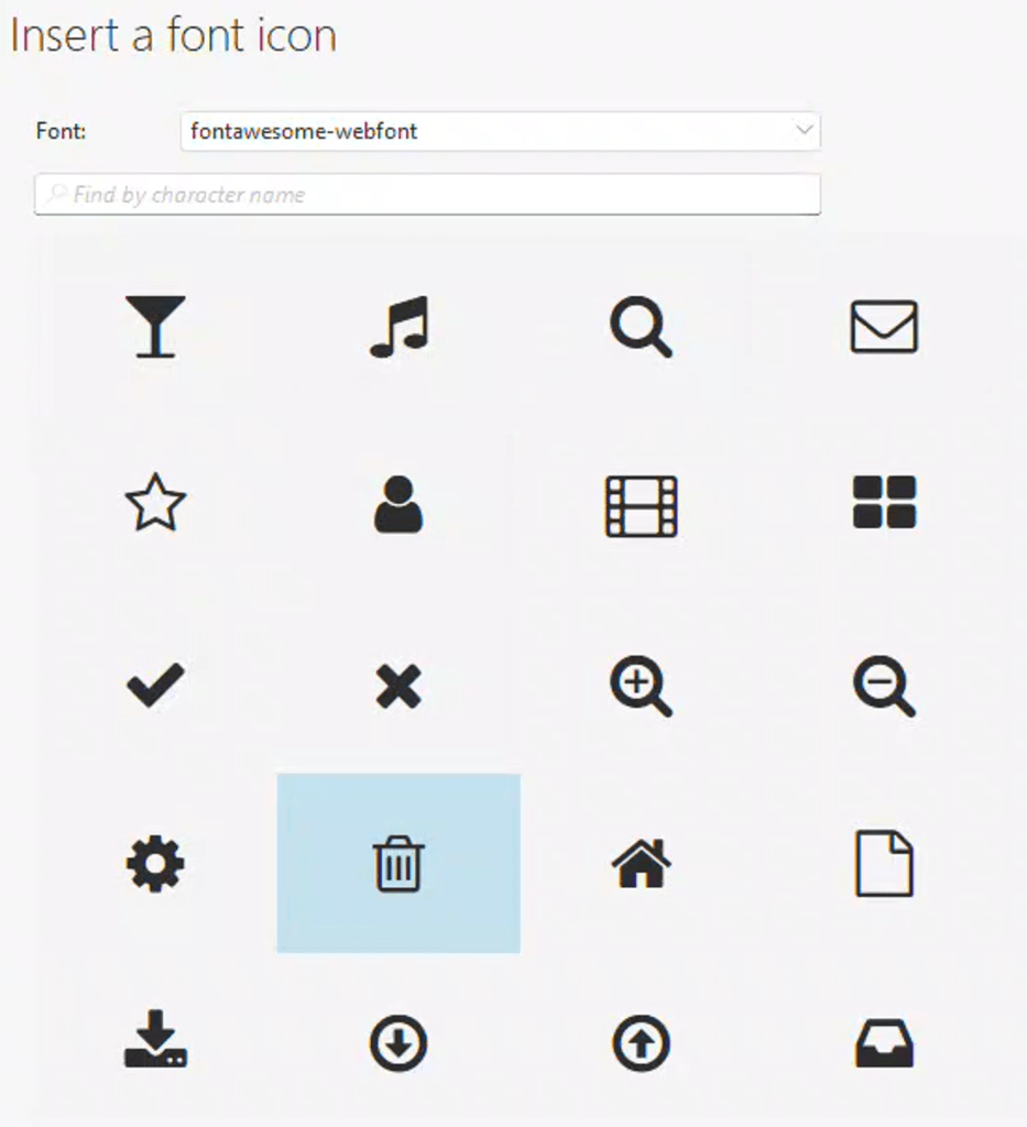
When you choose the ‘edit with formatting’ option, the IDE shifts to a word processor-style editing mode for the caption, and the ribbon bar then changes to the text tab. Notice the button titled “Font icons” on the right.
This provides us with a variety of font libraries to select from.
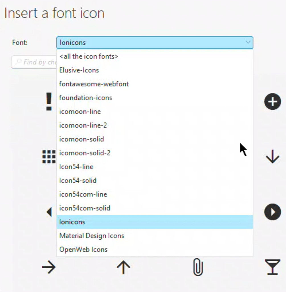
We can choose an appropriate icon for our button.
Adjusting the size, color, and other properties of this graphic is the same as modifying any other text.

My upcoming article will delve deeply into font icons. If you’re unfamiliar with them, hopefully, this has piqued your interest!
