
This is my third and hopefully final article on font icons! Ironically, by the end of this piece, we’ll drop the term “font” altogether. We’ll be using inline SVGs for icons, thereby eliminating the need for the browser to download fonts. This will also solve several problems associated with the use of font icons in WEBDEV.
A Bit of History
Before we start, if you’d like to review the previous articles, feel free to take a look at them.
Despite using font icons for over seven years, starting from version 22, I’ve never been completely satisfied with them. They’ve always seemed somewhat mysterious to me. The “WEBDEV” method through the Font Icon interface would result in an unrecognizable Unicode character in the HTML source of the control’s caption. Occasionally it would display correctly in the IDE, other times it wouldn’t, and the site’s browser rendering was also inconsistent. New IDE versions caution that your project must be set to Unicode to use Icon Fonts, but I’ve found this doesn’t make any difference. I also found the process of changing the icon through the graphical interface burdensome, especially when I had a series of buttons with the same style, with the only difference being the icon.
In the previous article, I discussed using HTML Escape codes to represent the Unicode value of an icon. This method simplified the process of changing icons, as you only need to alter the Unicode value. However, the inconsistency between the IDE display and browser rendering remained a problem. Moreover, finding the correct Unicode value for a specific icon was challenging. It often required using cheat sheet sites that list the icons and their codes. These sites, however, are not entirely reliable. Many icon fonts have multiple versions of the font files, and there’s no documentation clarifying which versions WEBDEV includes.
I’ve since discovered that many of the display and rendering issues were related to browser caching and whether the font files were loaded. For unknown reasons, sometimes WEBDEV would stop including the HTML code necessary to load the font. I would have to take extra steps to restore it. This often occurred when I published an update, and suddenly, all my icons turned into square boxes.
Over the years, I’ve learned a few tricks. However, as I started this new Modern Web Design series, I thought it would be a good time to explore if there’s a better way.
SVG to the Rescue
PCSOFT continues to enhance WEBDEV by incorporating the latest web technologies. One of these new features is the support for SVG images, particularly inline SVG images.
SVG stands for Scalable Vector Graphics. SVG files consist of mathematical formulas that represent images through points and lines on a grid. This enables SVG files to be scaled up or down without a loss in resolution. It is essentially an extension of XML, making the files readable as XML text.
There are two types of SVG. Normal SVG, following its XML parent, is quite verbose. For instance, consider the text of a random SVG file for one of PCSOFT’s template images.
<?xml version="1.0" encoding="utf-8"?>
<!-- Generator: Adobe Illustrator 15.0.0, SVG Export Plug-In . SVG Version: 6.00 Build 0)  -->
<!DOCTYPE svg PUBLIC "-//W3C//DTD SVG 1.1//EN" "<http://www.w3.org/Graphics/SVG/1.1/DTD/svg11.dtd>">
<svg version="1.1" id="Calque_1" xmlns="<http://www.w3.org/2000/svg>" xmlns:xlink="<http://www.w3.org/1999/xlink>" x="0px" y="0px"
	 width="228px" height="228px" viewBox="0 0 228 228" enable-background="new 0 0 228 228" xml:space="preserve">
<g display="none" opacity="0.2">

		<linearGradient id="SVGID_1_" gradientUnits="userSpaceOnUse" x1="2062.6348" y1="-2174.248" x2="2222.739" y2="-2334.3518" gradientTransform="matrix(1 0 0 -1 -2029.2988 -2140.9189)">
		<stop  offset="0" style="stop-color:#E6E6E6"/>
		<stop  offset="1" style="stop-color:#949494"/>
	</linearGradient>
	<path display="inline" fill="url(#SVGID_1_)" d="M113.387,226.646c-62.453,0-113.261-50.813-113.261-113.27
		S50.934,0.12,113.387,0.12c62.453,0,113.261,50.808,113.261,113.26C226.646,175.838,175.84,226.646,113.387,226.646
		L113.387,226.646z M113.387,8.275c-28.077,0-54.473,10.934-74.325,30.787S8.275,85.309,8.275,113.385
		c0,28.077,10.934,54.473,30.787,74.325s46.249,30.787,74.325,30.787c28.076,0,54.47-10.935,74.321-30.787
		c19.854-19.851,30.788-46.246,30.788-74.325c0-28.076-10.934-54.473-30.788-74.323C167.857,19.209,141.463,8.275,113.387,8.275
		L113.387,8.275z"/>
	<path display="inline" fill="#999999" d="M113.387,0c62.62,0,113.384,50.764,113.384,113.386
		c0,62.621-50.771,113.386-113.384,113.386C50.765,226.771,0,176.007,0,113.386C0,50.764,50.765,0,113.387,0 M113.387,218.372
		c28.044,0,54.406-10.92,74.233-30.75c19.831-19.828,30.75-46.192,30.75-74.236c0-28.042-10.919-54.407-30.75-74.236
		C167.793,19.32,141.432,8.4,113.387,8.4c-28.045,0-54.408,10.92-74.237,30.75C19.32,58.979,8.4,85.343,8.4,113.386
		c0,28.044,10.92,54.408,30.75,74.236C58.979,207.452,85.343,218.372,113.387,218.372 M113.387,0.25
		c-30.22,0-58.631,11.768-80,33.137C12.019,54.755,0.25,83.166,0.25,113.386s11.769,58.632,33.137,79.999
		c21.368,21.368,49.78,33.137,80,33.137c30.218,0,58.63-11.769,79.998-33.137c21.368-21.367,33.137-49.779,33.137-79.999
		s-11.769-58.631-33.137-79.999C172.018,12.018,143.605,0.25,113.387,0.25L113.387,0.25z M113.387,218.622
		c-28.111,0-54.538-10.946-74.414-30.823C19.097,167.924,8.15,141.497,8.15,113.386c0-28.11,10.946-54.537,30.823-74.413
		C58.849,19.097,85.276,8.15,113.387,8.15c28.109,0,54.536,10.946,74.41,30.823c19.877,19.875,30.823,46.302,30.823,74.413
		c0,28.112-10.946,54.539-30.823,74.413C167.923,207.676,141.497,218.622,113.387,218.622L113.387,218.622z"/>
</g>
<path fill="#5F5F5F" d="M114.063,4.125c29.365,0,56.973,11.436,77.737,32.2c20.765,20.764,32.2,48.372,32.2,77.737
	s-11.436,56.973-32.2,77.737C171.036,212.563,143.43,224,114.063,224c-29.366,0-56.973-11.436-77.737-32.2
	c-20.765-20.765-32.2-48.372-32.2-77.737s11.436-56.973,32.2-77.737C57.09,15.561,84.698,4.125,114.063,4.125 M114.063,0.125
	C51.138,0.125,0.126,51.137,0.126,114.063C0.126,176.988,51.138,228,114.063,228c62.925,0,113.938-51.012,113.938-113.938
	S176.988,0.125,114.063,0.125L114.063,0.125z"/>
</svg>
An optimized version of SVG also exists. It is significantly compressed and reduces redundancies in path entries. This version is particularly useful for inline SVG. Below is an example of how the code for the same SVG image looks after optimization:
<svg xmlns="<http://www.w3.org/2000/svg>" width="228" height="228" xml:space="preserve">
<path fill="#5F5F5F" d="M114.063 4.125c29.365 0 56.973 11.436 77.737 32.2 20.765 20.764 32.2 48.372 32.2 77.737s-11.436 56.973-32.2 77.737C171.036 212.563 143.43 224 114.063 224c-29.366 0-56.973-11.436-77.737-32.2-20.765-20.765-32.2-48.372-32.2-77.737s11.436-56.973 32.2-77.737C57.09 15.561 84.698 4.125 114.063 4.125m0-4C51.138.125.126 51.137.126 114.063.126 176.988 51.138 228 114.063 228s113.938-51.012 113.938-113.938S176.988.125 114.063.125z"/>
</svg>
I’ve mentioned inline SVG a few times. Modern browsers support embedding SVG source tags directly in the HTML code. Thus, rather than loading an image from a file, the image is included straight in the HTML. It’s worth noting that modern browsers also support inline images for non-vector images through inline base64 encoding. However, these images aren’t scalable or optimized, making them less suitable for icons.
Using inline SVG for all our icons can eliminate the necessity for the browser to download the font file, resolving display and consistency issues associated with font icons. Regarding performance, browsers are adept at rendering well-optimized inline SVG. For more details, here is a great article that explores the performance of various methods for displaying a large number of icons on a page, demonstrating the efficiency of well-optimized inline SVG.
Where to get SVG icons?
A quick Google search can easily find free SVG icons on the web. The advantage of using inline SVG is that you aren’t tied to a specific icon library. Each icon is a standalone SVG that can be combined and used according to your needs.
I primarily use Font Awesome for icons. While this name may sound familiar, as it is one of the font icon files included with WEBDEV, it’s important to note that WEBDEV comes with version 4.7.0. However, the latest available version is 6.5.2.
The website offers 2,045 free icons, providing plenty of options to keep you engaged. If you want a larger selection, you can access 30,199 icons for an annual fee of $99.
There are several methods of using the icons, such as utilizing a comprehensive font file, creating a custom font file with only necessary icons, accessing the icons via a Content Delivery Network (CDN) using their JavaScript kit and icon class names, and so on. However, I will save you the trouble of evaluating all these methods as each has its pros and cons when applied in WEBDEV. Based on my experience, the inline SVG method has proven to be the most straightforward and dependable.
The TailwindCSS way
In this new series, I heavily rely on TailwindCSS, as discussed in previous articles. I’ll first explain how I’m using icons through this method. For those not using TailwindCSS, I’ll provide some bonus material at the end of the article.
If you’re using our wxTailwind skin or have followed the steps in the related article, your project is already configured to exclude any font icon files. Since there’s no need to use these files, it doesn’t make sense for the browser to download them!
Selecting an Icon and getting the SVG code
Let’s begin by creating a 24×24 button featuring a pencil icon. This will be used as the edit button on our looper rows.
The first step is to visit the Font Awesome website and select an icon. To limit your options to free icons, apply the Free filter and search for ‘edit’. This will present you with 116 icons to choose from. For this button, I decided to use the ‘pencil’ icon.
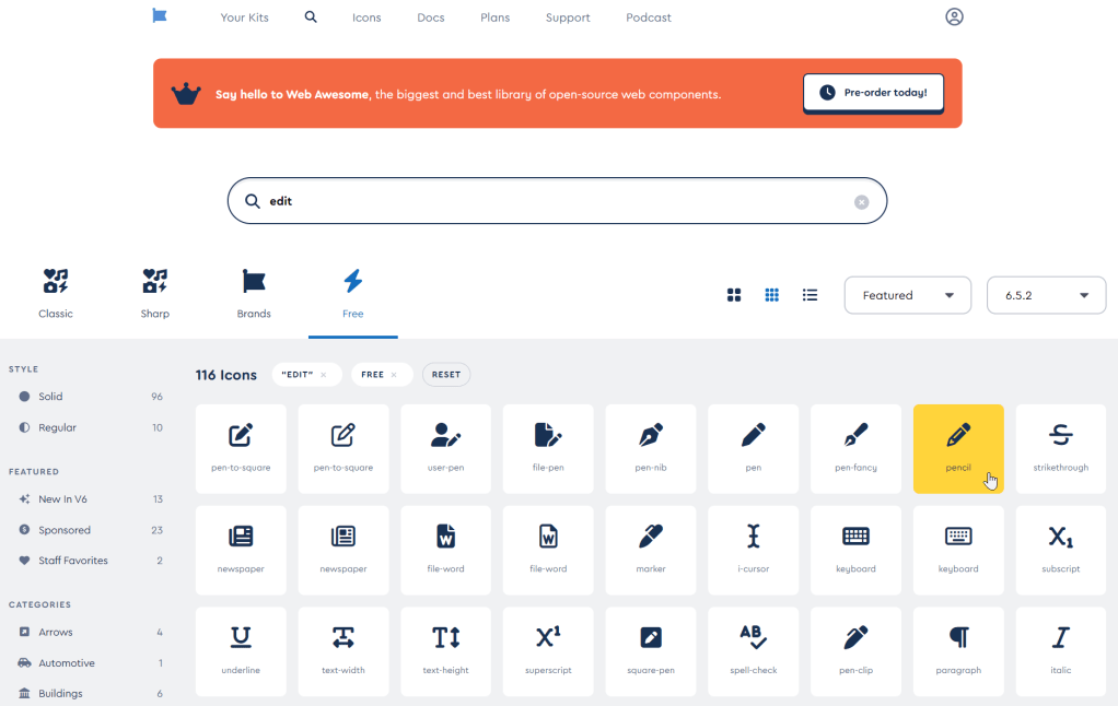
Clicking on the icon opens a popup with detailed information. This icon is from the Classic collection, where most of the free icons are located. Several variations of the icon, including solid, regular, light, Duotone, and thin, are displayed along the top. However, the solid version is typically the only free option. Above these variations, you’ll find the Unicode value. If you’re using my previous method, keep in mind that some of these codes may not match the existing WEBDEV version of the font file since they are from different versions.
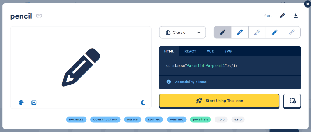
This screen has various features like styling and animations, but our main focus is the optimized SVG code, which is located in the last tab of the interface.
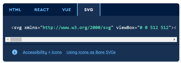
After clicking on the tab, if you select the section containing the code, it will be copied to your clipboard. The code will look similar to this. For ease of understanding, I’ve added a few line breaks, although it will appear on a single line in actuality.
<svg xmlns="<http://www.w3.org/2000/svg>" viewBox="0 0 512 512">
<!--!Font Awesome Free 6.5.2 by @fontawesome - <https://fontawesome.com> License - <https://fontawesome.com/license/free> Copyright 2024 Fonticons, Inc.-->
<path d="M410.3 231l11.3-11.3-33.9-33.9-62.1-62.1L291.7 89.8l-11.3 11.3-22.6 22.6L58.6 322.9c-10.4 10.4-18 23.3-22.2 37.4L1 480.7c-2.5 8.4-.2 17.5 6.1 23.7s15.3 8.5 23.7 6.1l120.3-35.4c14.1-4.2 27-11.8 37.4-22.2L387.7 253.7 410.3 231zM160 399.4l-9.1 22.7c-4 3.1-8.5 5.4-13.3 6.9L59.4 452l23-78.1c1.4-4.9 3.8-9.4 6.9-13.3l22.7-9.1v32c0 8.8 7.2 16 16 16h32zM362.7 18.7L348.3 33.2 325.7 55.8 314.3 67.1l33.9 33.9 62.1 62.1 33.9 33.9 11.3-11.3 22.6-22.6 14.5-14.5c25-25 25-65.5 0-90.5L453.3 18.7c-25-25-65.5-25-90.5 0zm-47.4 168l-144 144c-6.2 6.2-16.4 6.2-22.6 0s-6.2-16.4 0-22.6l144-144c6.2-6.2 16.4-6.2 22.6 0s6.2 16.4 0 22.6z"/>
</svg>
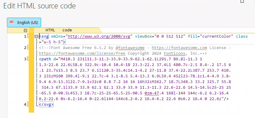
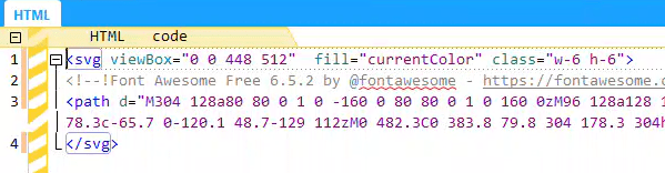
We need to adjust the SVG tag slightly. By setting the fill attribute to “currentColor”, the icon will adjust its color based on the font color of the parent element. The viewBox is set to 512 x 512, which is the default size for the icon, a tad too large for my preference. So, I’ll add a couple of Tailwind classes “w-5” and “h-5” to resize the icon to 20 x 20 pixels. Although I initially mentioned creating a 24×24 icon, we’ll address the remaining 4 pixels shortly. Here’s how the final SVG code looks.
<svg xmlns="<http://www.w3.org/2000/svg>" viewBox="0 0 512 512" fill="currentColor" class="w-5 h-5">
<!--!Font Awesome Free 6.5.2 by @fontawesome - <https://fontawesome.com> License - <https://fontawesome.com/license/free> Copyright 2024 Fonticons, Inc.-->
<path d="M410.3 231l11.3-11.3-33.9-33.9-62.1-62.1L291.7 89.8l-11.3 11.3-22.6 22.6L58.6 322.9c-10.4 10.4-18 23.3-22.2 37.4L1 480.7c-2.5 8.4-.2 17.5 6.1 23.7s15.3 8.5 23.7 6.1l120.3-35.4c14.1-4.2 27-11.8 37.4-22.2L387.7 253.7 410.3 231zM160 399.4l-9.1 22.7c-4 3.1-8.5 5.4-13.3 6.9L59.4 452l23-78.1c1.4-4.9 3.8-9.4 6.9-13.3l22.7-9.1v32c0 8.8 7.2 16 16 16h32zM362.7 18.7L348.3 33.2 325.7 55.8 314.3 67.1l33.9 33.9 62.1 62.1 33.9 33.9 11.3-11.3 22.6-22.6 14.5-14.5c25-25 25-65.5 0-90.5L453.3 18.7c-25-25-65.5-25-90.5 0zm-47.4 168l-144 144c-6.2 6.2-16.4 6.2-22.6 0s-6.2-16.4 0-22.6l144-144c6.2-6.2 16.4-6.2 22.6 0s6.2 16.4 0 22.6z"/>
</svg>
We are ready to move over to WEBDEV.
💡 Take note of the comment line in the SVG code. This comment is a requirement from Font Awesome for the use of their free icons, so ensure not to remove it!
Create the button in WEBDEV
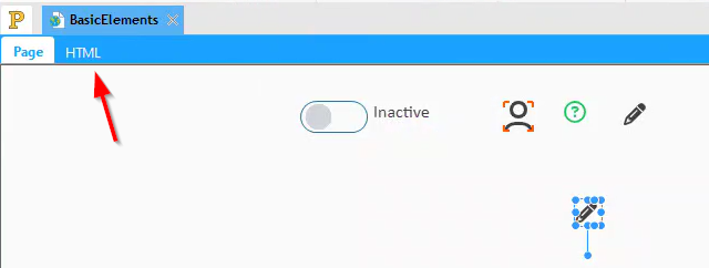
When using the wxTailwind skin, the default button styling is quite basic. To enhance it, we need to incorporate our SVG code into the HTML caption. This can be done by navigating to the general tab of the description and clicking on the ‘Edit HTML code’ link.
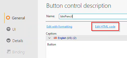
Replace the word ‘Button’ with our SVG code.
💡 There's a shortcut to access the HTML code of the caption. When you select the button in the IDE, an HTML tab will become visible. Clicking on this tab will display the edit screen.
On the UI tab, set the button dimensions to 24 x 24.

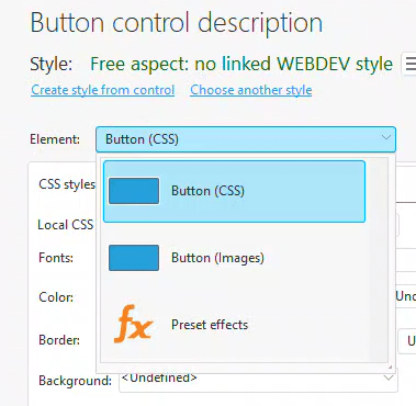
In the style tab, some default styling is already set up. This is because there are no specific WebDev styles for buttons in the wxTailwind skin. To begin, we should remove all of this to start with a clean slate.
For the Button (CSS) element, we need to clear all selections so they are set to blank, undefined, or inherited. A shortcut for this is to add a random class name in the CSS styles. You’ll get a prompt asking if you want to remove the local CSS. Answer ‘yes’, and it will clear all those settings for you.
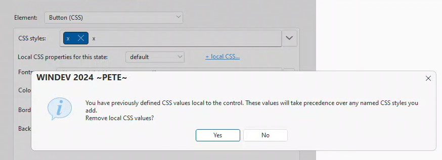
After clearing all the settings, simply delete the random class name to have a clean slate.
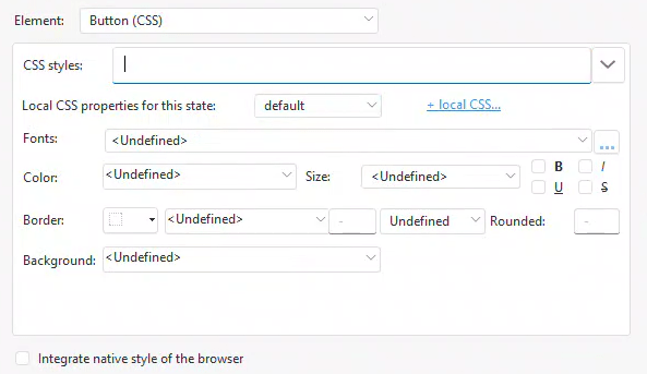
If the Border/Background (Compatibility) Element is on the list, make sure to clear its settings.
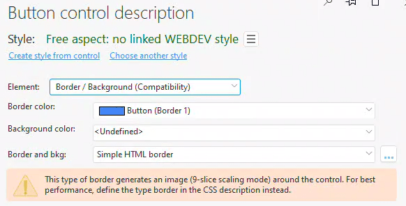
After you do so, it will no longer be in the list.
Styling the Button
We have created our basic button, but it requires additional styling.

It’s time to add our first custom CSS class to the input-tailwind.css file. If you’re unsure about this, you may want to revisit the article where I initially introduced the input-tailwind.css file.
This article explains the basic setup for our wxTailwind Skin.
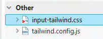
💡 Tip: Add both the input-tailwind.css and tailwind.config.js files to the "Other" section of the project explorer. This makes them easier to access and includes them in the SCM.
Since this is the first class we’ve added to our input-tailwind.css file, we need to create a new component layer. Within this new section, I will create a btn-icon class. After incorporating the changes mentioned in previous articles, our input-tailwind.css file now looks as follows:
@tailwind base;
@tailwind components;
@tailwind utilities;

@layer base {
	html {
		@apply font-humanist;
		@apply text-base;
		@apply text-neutral-700;
		@apply leading-tight;
	}
	body {
		@apply font-humanist;
		@apply text-base;
		@apply text-neutral-700;
		@apply leading-tight;
	}
}
@layer components {
	/* Button */
	.btn-icon {
		@apply p-0.5 text-logoblue hover:text-blue-900 disabled:text-gray-300;
		@apply rounded-lg;
		@apply transition;
		@apply focus:outline-none focus-visible:bg-blue-100 focus-visible:text-blue-900;
	}
}
One of the significant features of Tailwind is allowing us to create a custom class with all desired settings, instead of adding every utility class to each control. By using the @apply function, we can employ Tailwind classes without knowing specific CSS code. Also, note that the extensions we added, such as our ‘logoblue’ color, are readily available.
Let’s examine some of these classes and their functions.
“p-0.5” adds .125rem (2px) of padding. This is the reason why my icon is 20 x 20 and my button is 24 x 24.
The default color is set to our custom logo-blue color. It changes to a darker shade of blue when hovered over and turns light gray when the button is disabled.
“rounded-lg” sets the border edges to be rounded, with “lg” acting as a size modifier. While it may seem like we don’t have a border due to its lack of display, defining it still impacts the focus settings we are about to configure.
“Transition” integrates a basic 150ms transition to the control when the CSS is altered, providing a subtle shift rather than a stark jump from one state to the next.
Lastly, we’ll tackle the fancy elements. You’ll notice these will be omitted from the WEBDEV styling version in the bonus section. This is because they would likely require direct CSS manipulation in the advanced section, which is more laborious. This is precisely why I prefer using Tailwind in the first place!
Have you ever noticed how the browser adds a blue ring around a button when you select it? Or how, even on a nicely rounded button, that ring remains square and unattractive? We’re about to fix all of that!
“focus:outline-none” prevents the standard focus effect from happening. “focus:” is one of the state prefixes available in Tailwind, similar to “hover:” and “disabled:” that we used before. By setting it to “outline-none”, we avoid the blue outline around our button when it’s in focus.
In the next two classes, we’re using the ‘focus-visible:’ prefix. This special prefix behaves differently based on the control. For controls that have an action, like buttons, the ‘focus-visible:’ prefix applies when the control gains focus via the keyboard. However, it doesn’t apply if the control gains focus via the mouse.
So adding “focus-visible:bg-blue-100” and “focus-visible:text-blue-900” gives our button a slight blue background, which is rounded because of the “rounded” class we already added, and we darken the text the same as we did on hover.
Adding “focus-visible:bg-blue-100” and “focus-visible:text-blue-900” gives our button a slight blue background and darkens the text, similar to the hover state. The background is rounded due to the previously added “rounded” class.
The end result is a default button that looks like this.

When hovered over, it appears like this.

And this, if selected by keyboard.

I recognize the differences are subtle, but they are worth the effort when striving to create a sleek, modern interface.
Alternative on a Theme
There’s a delicate balance between creating too many custom classes, resulting in a CSS mess similar to traditional CSS, and repeatedly using many utility classes on each control. Let’s explore a technique I use to maintain this balance.
A common modification for the delete button is to make it red. We could create a new custom style, but since it’s likely that the delete button is the only one that needs to be red, we can simply add the ‘btn-icon’ class. Then, we can add a few extra classes to override the settings we want to change.
By using “text-red-400”, “hover:text-red-900”, “focus-visible:bg-red-100”, and “focus-visible:text-red-900”, we create a button that features shades of red instead of blue.
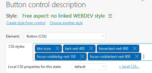

💡 Tip: After adding the classes, remember to manually regenerate the tailwind.css file by running the TailwindCSS CLI.
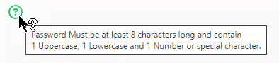
Onscreen Help Tips
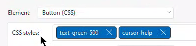
By using just two classes, “text-green-500” and “cursor-help”, along with adding tooltip text, I can create on-screen help tips.
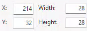
A Slightly Larger Button
By modifying the classes of my SVG to “w-6” and “h-6”.
And making the button 28×28, I am able to create a slightly larger button for the “My profile” editing.

A Nicer Checkbox for Booleans on My Loopers
It takes three classes to create an enhanced checkbox that can represent Active/Inactive states in loopers, etc.


The “text-green-500” class sets the text green by default. If disabled, the text turns gray due to the “disabled:text-gray:300” class. The “pointer-events-none” class stops the cursor from changing when it hovers over the text.
Mixing in some Text
For a left-hand toolbar, we typically need an icon and some text. To achieve this, I use the btn-icon class, similar to the first example, but modify the button dimensions to 140 x 32. In the HTML code for the caption, I include my SVG as usual. However, this time I enclose both the SVG and my text caption within a <span>, to which I assign three Tailwind classes.
“flex” turns it into a flexbox, “items-center” vertically centers everything inside the span, and “gap-2” sets the gap between items to .5rem (8px).
<span class="flex items-center gap-2">
<svg xmlns="<http://www.w3.org/2000/svg>" viewBox="0 0 512 512" fill="currentColor" class="w-5 h-5"><!--!Font Awesome Free 6.5.2 by @fontawesome - <https://fontawesome.com> License - <https://fontawesome.com/license/free> Copyright 2024 Fonticons, Inc.--><path d="M32 32c17.7 0 32 14.3 32 32V400c0 8.8 7.2 16 16 16H480c17.7 0 32 14.3 32 32s-14.3 32-32 32H80c-44.2 0-80-35.8-80-80V64C0 46.3 14.3 32 32 32zM160 224c17.7 0 32 14.3 32 32v64c0 17.7-14.3 32-32 32s-32-14.3-32-32V256c0-17.7 14.3-32 32-32zm128-64V320c0 17.7-14.3 32-32 32s-32-14.3-32-32V160c0-17.7 14.3-32 32-32s32 14.3 32 32zm64 32c17.7 0 32 14.3 32 32v96c0 17.7-14.3 32-32 32s-32-14.3-32-32V224c0-17.7 14.3-32 32-32zM480 96V320c0 17.7-14.3 32-32 32s-32-14.3-32-32V96c0-17.7 14.3-32 32-32s32 14.3 32 32z"/></svg>
Budgets</span>
Giving us a button with a text caption that behaves the same as our other buttons.

A few miscellaneous tips
While all the examples I provided were buttons, you can use inline SVGs in any location where you can create an HTML caption. This includes Rich Text statics, Dropdown and Edit captions, Radio and Checkbox captions and options, among others.
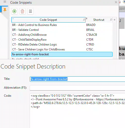
You might find it inconvenient to copy the SVG code from Font Awesome, and then add the fill color and size class every time. Although it may seem like you need a variety of different icons in your app, you usually don’t need as many as you think. Basic icons like add, change, and delete are often repeated, but you can avoid redundancy with control templates or other methods. If there are frequently used SVGs and you don’t want to copy and paste the code each time, consider using code bricks/snippets as a useful storage solution.
Bonus Material – Using WEBDEV styles
Throughout most of this series, I will mainly discuss Tailwind solutions. However, I believe inline SVGs are important enough to warrant basic coverage for those not using Tailwind.
Recreating the Edit button with WEBDEV styles
We create our 24×24 button, remove all default styling as before, and place the SVG code in the HTML caption as before. The only difference is that we use the true CSS width and height syntax instead of Tailwind classes.
<svg xmlns="<http://www.w3.org/2000/svg>" viewBox="0 0 512 512" fill="currentColor" style="width:20px;height:20px">
<!--!Font Awesome Free 6.5.2 by @fontawesome - <https://fontawesome.com> License - <https://fontawesome.com/license/free> Copyright 2024 Fonticons, Inc.-->
<path d="M410.3 231l11.3-11.3-33.9-33.9-62.1-62.1L291.7 89.8l-11.3 11.3-22.6 22.6L58.6 322.9c-10.4 10.4-18 23.3-22.2 37.4L1 480.7c-2.5 8.4-.2 17.5 6.1 23.7s15.3 8.5 23.7 6.1l120.3-35.4c14.1-4.2 27-11.8 37.4-22.2L387.7 253.7 410.3 231zM160 399.4l-9.1 22.7c-4 3.1-8.5 5.4-13.3 6.9L59.4 452l23-78.1c1.4-4.9 3.8-9.4 6.9-13.3l22.7-9.1v32c0 8.8 7.2 16 16 16h32zM362.7 18.7L348.3 33.2 325.7 55.8 314.3 67.1l33.9 33.9 62.1 62.1 33.9 33.9 11.3-11.3 22.6-22.6 14.5-14.5c25-25 25-65.5 0-90.5L453.3 18.7c-25-25-65.5-25-90.5 0zm-47.4 168l-144 144c-6.2 6.2-16.4 6.2-22.6 0s-6.2-16.4 0-22.6l144-144c6.2-6.2 16.4-6.2 22.6 0s6.2 16.4 0 22.6z"/>
</svg>
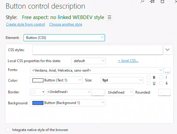
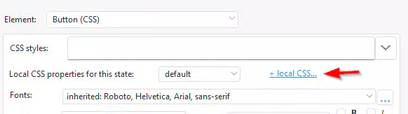
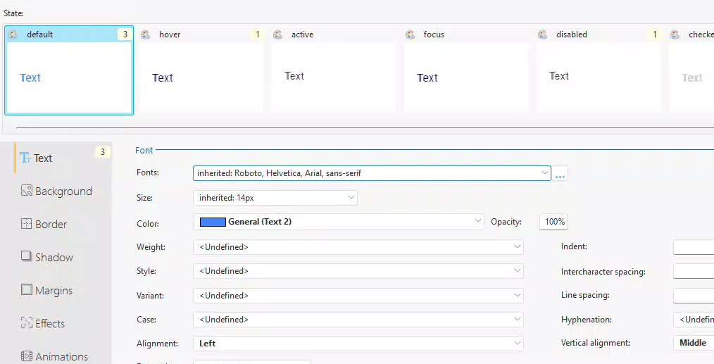
On the WEBDEV style for the Button (CSS) element, there is not much point in messing with the basic settings as much of what we need is only available via the +local CSS link, so click on it.
For the Button (CSS) element in WEBDEV style, most of the necessary adjustments are only available through the +local CSS link. Therefore, adjusting the basic settings on the primary screen isn’t very beneficial. So click on the +local CSS link to proceed.
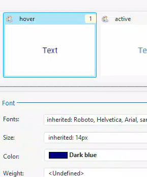
On the ‘Default State Text’ tab, I set the text color to light blue and aligned it to be centered horizontally and in the middle vertically.
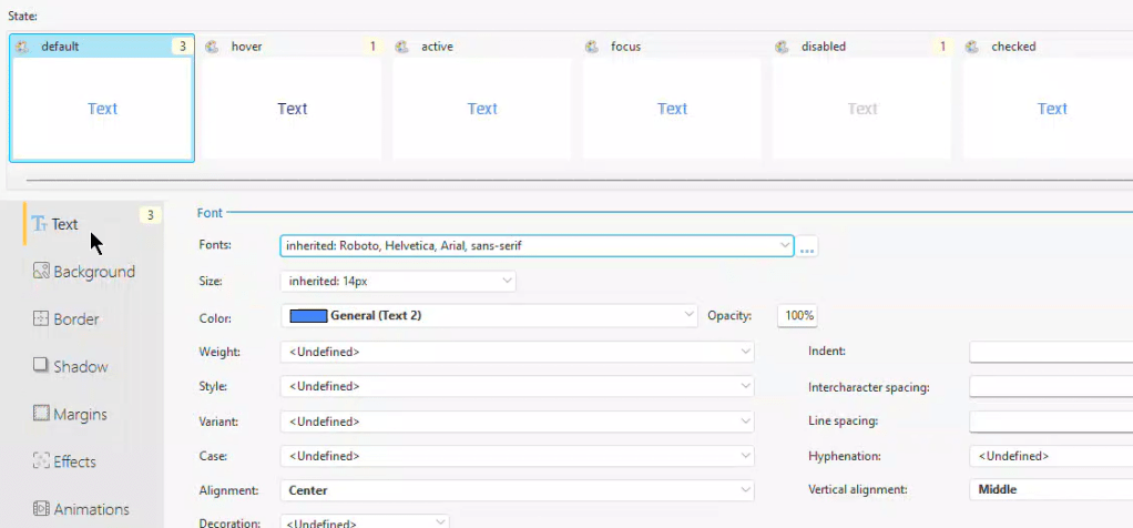
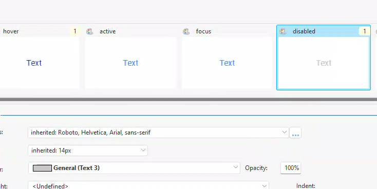
I change the color to a darker blue in the hover state.
I change it to gray when in the disabled state.
This provides us with a button that behaves similarly to my Tailwind version, except for the additional focus settings I applied in Tailwind. If someone wants to replicate these settings in the WEBDEV style interface, I would be glad to share the details. However, adjusting the numerous tabs and states just to implement the few settings I did felt exhausting to me!
Recreating the Left Menu button with WEBDEV styles
Start again with a 140 x 32 button, removing all the default styling. Configure all the WEBDEV local CSS the same way as done for the edit button, with the only difference being its left alignment.
We enclose the SVG code with a <Span> just as we did in the Tailwind version, but we need to make several other changes to the CSS.
<span style="vertical-align: middle;">
<svg xmlns="<http://www.w3.org/2000/svg>" viewBox="0 0 512 512" fill="currentColor" style="width:20px;height:20px;vertical-align: middle;margin-right: 8px;"><!--!Font Awesome Free 6.5.2 by @fontawesome - <https://fontawesome.com> License - <https://fontawesome.com/license/free> Copyright 2024 Fonticons, Inc.--><path d="M32 32c17.7 0 32 14.3 32 32V400c0 8.8 7.2 16 16 16H480c17.7 0 32 14.3 32 32s-14.3 32-32 32H80c-44.2 0-80-35.8-80-80V64C0 46.3 14.3 32 32 32zM160 224c17.7 0 32 14.3 32 32v64c0 17.7-14.3 32-32 32s-32-14.3-32-32V256c0-17.7 14.3-32 32-32zm128-64V320c0 17.7-14.3 32-32 32s-32-14.3-32-32V160c0-17.7 14.3-32 32-32s32 14.3 32 32zm64 32c17.7 0 32 14.3 32 32v96c0 17.7-14.3 32-32 32s-32-14.3-32-32V224c0-17.7 14.3-32 32-32zM480 96V320c0 17.7-14.3 32-32 32s-32-14.3-32-32V96c0-17.7 14.3-32 32-32s32 14.3 32 32z"/></svg>
Budgets</span>
We should utilize ‘vertical-align: middle’ instead of flexBox. Although flexBox could be used, the standard CSS for it is a bit complex. The SVG sizes also need to be changed to CSS width and height, similar to the button adjustments. Additionally, ‘vertical-align: middle’ should be added to this CSS style. Lastly, incorporate ‘margin-right: 8px’ to allow for an 8-pixel gap between the icon and the text. While not an impossible task, I certainly have a preference for the Tailwind version!
💡 Gavin Webb provided a tip: You may notice that some of the Font Awesome icons are not actually square, as indicated by their viewBox entries. For instance, the Home icon has a viewBox of 576 x 512 which was causing slight discrepancies in the vertical alignment between the button and the text. By increasing the 512 to 600, it added white space to the icon and altered its ratio, thereby improving the vertical alignment. It's important to note that reducing the size of the viewBox will cut off part of the image. However, you can increase it to add white space as needed.
What’s next?
Next, we should explore flexBox. It’s integral to the interface, and I think it’s essential to understand it before we delve deeper into the general layout. In the meantime, you can download the latest version of the wxTailwind project, which includes the additions discussed in this article, from the link provided.
 wxBlog - All things wx – Covering pcSoft products (WINDEV, WEBDEV, WINDEV Mobile)
One thought on “Font Icons 3: This time it’s about SVG”