
Feature 020 and 021 are about the new Smart Magnetism, but what does that mean? And just how good is it? Read on my weary developers
First I will say Smart Magnetism is the cat’s meow. In fact, it is so good that I have been using it without even realizing I am using it! I rarely find myself needing to use the alignment tab of the toolbar anymore, other than to force fields to be the same size, etc.
It does quite a bit of showing you indicator lines for a few seconds, but as you continue to move around it is constantly hiding or showing you different references. That may sound like a bad thing but it isn’t, its very intuitive and seems to always be showing me exactly what I need to know when I need to know it.
This is one of those features that is hard to show or explain, you just sort of have to use it to get it. But let me give you a few previews at least.
Here it is showing me my state control will align by bottom with my address control. What great is this now gives you those types of references even if the controls are not close to one another or if there are other controls in between them.

Although this isn’t a practical example you can see it is giving me an option to line up the left side of the State control with the right side of the Cancel button, even though they are not near one another and there is even another control between them.

What if I want the right side of my State control to line up with the center of the longer group of controls. No problem, it shows me when I am there.

It impossible to show you a meaningful screenshot but when dropping a new control below a group of controls, you know like you do a 100 times a day when creating forms, it knows the standard spacing you are using between the controls and gives you a magnetism for that spot.
It will even show me the spacing between Save button I am moving and the State Control above it, along with a spacing indicator for between City and State, so I know I am using the same spacing.

Not specifically mentioned in the new features document, but sort of related and a real game-changer for me is improvements to how layout errors are shown in WebDev. Anyone that I have mentors in WebDev, or set through one of my presentations, or been unfortunate enough to be stuck in the seat next to me on a plane, has heard me say “Turn on Display Layout errors and Pink is bad!”
That is because Layout errors, such as having two controls overlapping, will almost certainly cause you unpredictable rendering issues when the site is displayed in the browser. Prior to 25, these layout errors were shown by obfuscating the overlayed portion of the controls in pink (hence the mantra “Pink is bad”).
Here’s is an example of what it would look like if I overlapped 3 fields in v24.

Here is the same layout error in v25. Notice its much easier to see the bounds of the controls that are causing the issue.

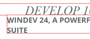
Still don’t think that is a drastic improvement, well that’s because I gave you an obvious error, now let’s look at a more common, you accidentally overlay 2 controls by 1 pixel, don’t know about you but it happens to me a lot when dealing with headers and table/looper controls, etc.
In v24. Look close, it’s there, that little sliver of pink is indicating the issue.

In v25. How ya like me now! Which of those is easier to spot and resolve!
The bottom line neither of these improvements would have made me rush out the door to upgrade to v25, but at the end of the day are going to save me countless hours of wasted time, which is why we can “Develop 10 times faster”.
Most of the time I am now positioning fields exactly where I want them, without having to use the arrow keys or the alignment menu to tweak them, and it is so intuitive that I am doing that without even realizing it! And when I do have a Layout issue not only is it very obvious, but its also easier to see exactly how to resolve it.
