
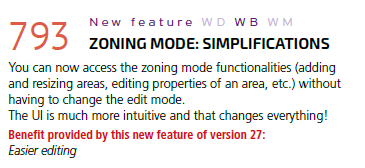
One of the “features” of WEBDEV v27 was a revamp of zone editing (Feature 793). Below is details from the New Features document.
It sounds so great and simple, but I believe it is at the core of some of the biggest issues a few of our clients have had with their WEBDEV v27 upgrades. Most of the sites I assist with haven’t had any issues at all, but I have had three sites, that seem to have absolutely lost their mind as part of the v27 upgrade. We will get to my theories about why shortly, but first, let me describe some of the issues
First, this isn’t really a bug, but more of a gripe, I am finding it very hard to edit and maintain zones in v27. They were never easy and I appreciate PCSOFT attempting to streamline the process, but I am not sure this update fully hits the mark. Prior to v27 you had to be in Zone editing mode to edit zones, and page editing mode to edit the actual controls, admittedly it was a bit confusing and more than once I have tried to edit a control and wonder why it isn’t working only to realize I was in zone mode. However, the nice thing was that when in zone mode the controls were subdued and there were borders clearly showing where your zones were, btw referred to as areas not zones in the idea.
Now that we don’t have zone edit mode, I am finding it much harder to identify my zones and edit them. I wish there was a specific checkbox in the display area to at least give me the old border coloring of the zones so I could turn that on and off.
The difference between zones and cells has always been a bit fuzzy for me, and how I have always explained it is zones are for the may layout/sections of your website. While cells on the other hand are for displaying around a group of controls and or containing them for a purpose. They are more or less the same thing except zones are at the page level and higher up the hierarchy than cells. Cells go in zones, zones don’t go in cells. Think of zones as the basic layout. Header with Left Menu, and a single column content area, etc. That may all be as clear as mud but that is about the best I can do.
In this new world order without zone editing, it becomes even harder to tell a zone from a cell, literally I have to look at the control description or hope that the controls name prefix is correct. And it is hard to select a zone versus a control since now that can both be selected at the same time since there is no edit mode.
Ok, enough griping about the interface, what issues are we seeing and why do I think it relates to the new zone interface? First, let me say I haven’t been able to reproduce any of this in a coherent fashion that could be documented and submitted to support, but on the 3 sites that we have had issues, we have seen updating the pages after a template change totally rearrange the page, including moving around the controls of the template that weren’t overridden. This is especially true if the page isn’t the same size as the template, which is something we use often, we generally have our template defined as one viewport high, and then on the pages, we need extra height we extend it. Generally, all of our pages are the same width, and we use anchoring on the different zones to control how they resize.
We have also seen controls resize when applying a style, but only if we do so from the right-click context menu. We have an edit control that is 20px tall, right-click and take the “Choose a Webdev Style” menu option, select a style, and the control changes to 30px tall. If instead we right-click on the control, choose the Description Menu, switch to the Style tab and choose the same style, the control stays at the 20px height
We had one site that had a template with a content cell with a cell contained in it for the heading of the content and a static in that heading cell. The static was overridden to change the text on each page, but not the style, which was white, bold, and vertically centered. Randomly when we would change a page, either that page or even one of the other pages, would suddenly show that static as black, not bold, and not vertically centered. And it was completely random, as in it felt like a whack-a-mole game, as to which pages would suddenly have the issue. I was able to reproduce the fact that simply saving a page and regenerating its CSS would generate a completely different CSS file each time, I am happy to save that the 103s update seems to have solved this issue, but seem to have made the issue above and the issue below even worst!
And finally and this relates to pages becoming completely corrupted with how they are displaying, we have had one site that seemed to take it upon itself to convert a lot of cells into zones on a page, and then add new cells inside those zones, down to 3 levels of nesting.
How Do You Fix It?
I can’t give you a step-by-step of how to resolve these issues when they show up because just like the issue, the solution feels a bit random with a touch of magic sprinkled in. removing the template from the page, getting the page the same size as the template, reapplying the template, moving the controls into the appropriate cells/zones of the page and then resizing the page if needed, seems to be a scorched earth process that works somewhat reliability. Sometimes I just need to remove overrides and things start correcting. The bottom line resolving the issues once they show up is a lot of busy work and seems like it takes a while and sometimes 2 or three attempts before the project completely settles back down. This brings me to the best way to fix it is to prevent it.
How Do You Prevent It?
Prevention again feels like a bit of magic, and I don’t have any proof that all of this prevents the issues but I can say the project where I managed the design from the beginning and enforced my best practices have not shown any of the issues of other projects that didn’t necessarily follow the same level of rule enforcement.
Most of you that have sent through mentoring with me or watched any of my webinars have heard my soapbox speeches on most of these tips but here is a reminder list of Uncle Pete’s WEBDEV tips, and as I said the projects where we strictly adhered to these tips have not exhibited the issues of other projects, so there’s that 🙂
- Establish your Look and Feel at the start.
- This means working out your general page layout and creating templates
- If you are going to have different basic layouts for some pages, create multiple templates
- I generally have the following
- Master template
- This has the basic header and footer of the site along with the basic logo, and text that is the same for nearly all pages, the content section is one big section
- InternalPages template
- This template actually uses the Master template so anything changed there reflects on this page as well
- the content section may get broken up into a Left menu and right content, or a top menu and bottom content, etc. It also has my “are you still there logic”, security logic, etc.
- Sometimes depending on the site, there may be a tplBrowse and a tplForm template that use the InternalPages template as their base. Are you starting to see a theme here? so changes to the master or the internal pages template reflect on these templates as well
- External/Marketing template
- If I am doing some more “webby” type marketing pages generally that will have a different template or no template at all depending on what they are. But in general, I recommend doing the marketing side of the site in a more traditional web tool. and using subdomains to launch the app portion of the site.
- Other special templates are created for things I might be doing like looks etc.
- Master template
- I create an example interface page with all the different types of controls I will be using and establish a webdev style for each of those
- I create a custom palette for the project
- EVERY (Did I mention EVERY) control on your page should be assigned a project-specific WEBDEV style, never use the built-in styles of the skin.
- The reason I do this is the formatting seems more reliable and consistent, especially as the CSS has become more powerful and elaborate over the last couple of releases.
- If you decide to adjust styling later, you can change your project WEBDEV Style and it will be applied to every control that uses it. You can not change the Skin Specific styles and would have to adjust every control
- If the skin-specific style is exactly what you want, no problem. Just choose disassociate style, then it will enable the Add style option so you can create your own style that will be identical
- Avoid Style and template overrides as much as possible. If you are only going to have one control that is slightly different than your basic WEBDEV style, fine override it, but if there are going to be 20, create a new WEBDEV style. Really consider your template overrides as they can really prevent you from using the templates to their best advantage.
- Never check the “This control can be overlayed” option unless you absolutely need to, and if you do need to, still don’t do it! This check box should be titled “Break my pages HTML rendering”. CSS anchoring etc. can not do anything with the control when you turn this on. Pretty much the only time I turn this option on is for the hidden utility controls that you have all seen me use off to the side of the page.
- Make sure that you have “UI Audit” (Use to be “Layout Errors”) turned on. This will show a red border around any controls that overlap or have other issues that will cause issues with rendering. FOR THE LOVE OF ALL THAT IS HOLY, if you only take one thing from this article, take this. DO NOT allow any red borders on your controls. RED = BAD!!!!! This is practically guaranteed to cause you issues with how the page looks when it is rendered. HMTL and CSS are going to shove things around to fix the issue, and it’s not going to do it the way you want. NO TURNING THE ALLOW OVERLAY IS NOT THE CORRECT FIX FOR THIS!!! Please Please don’t just turn can be overlayed on, that is treating the symptom, not the disease. I am pretty sure all my WEBDEV mentoring clients have witnessed me having at least one meltdown over RED = BAD!!!
Those last 3 are things that I am pretty religious about, and especially #3 you will not find any red borders in projects I am working on! And as I said none of those projects have had the v27 issues that we have seen in other projects. My theory is that with the new zone logic, and a few other new features WEBDEV is trying to fix some of those issues for use under the covers but unfortunately the cure seems to be worst than the disease in some cases.
Don’t get me wrong I am happy to see them enhancing these features, we just are experiencing some growing pains right now, but I am certain we will be reaping the benefits of these enhancements as we move along.
